Advanced CSS
We use CSS to make websites classy and stylish. There has been a lot of enhancements in CSS using which you can style websites and add dynamic feeling using the advanced CSS features. I will discuss such features as well as few of the basic but important styling attributes. Let’s start.
1. Define a View Port Height, with color gradient:

.banner {
    background-image: linear-gradient(
        to right,
        yellow,
        blue
    );/*This is how you define a linear-gradient with 2 colors and provide the direction of the gradient*/
    height: 20vh;/*This is the ViewPort Height.*/
}
2. Radial Gradient
.banner {
    background-image: radial-gradient(
        white,
        green
    );
    height: 50vh;/*This is the ViewPort Height.*/
}

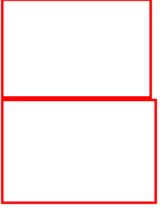
3. box-sizing: border-box;
This property helps to include the padding and border along with the width or height of an element. So, it helps to keep the total visible size of an element the same. Example below:
.withboxsizing {
    box-sizing: border-box;
    width: 300px;
    height: 200px;
    border: 5px solid red;
}

.withoutboxsizing {
    width: 300px;
    height: 200px;
    border: 5px solid red;
}
4. Define the font-family in order : You can define multiple font-family with comma separated values. The one available first from left will take effect.
body {
    font-family: 'Arial', 'Courier New', Courier, monospace;
}
If Arial is available, it will take effect. If not available, the browser will look for the next font i.e. ‘Courier New’ and son on..
5. Positioning an image properly in the screen using background-image, background-size, background-position and height.
.banner {
    background-image: url('./images/background-image.jpg');
    background-size: cover;/*This specifies that the image should cover the complete width available inside the parent element*/
    background-position: top;/*It specifies which portion of the image should stick into the element, and should not be cropped even when the view port is adjusted*/
    height: 80vh;/*This is the ViewPort Height.*/
}
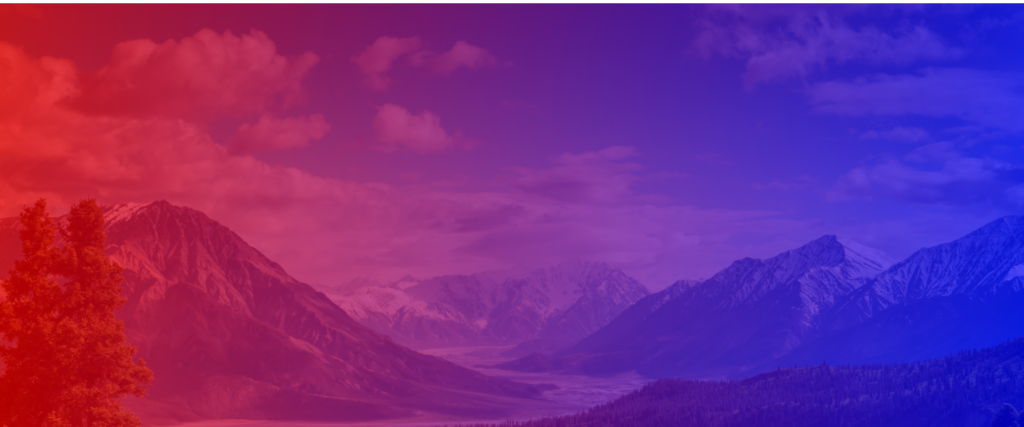
6. Creating an Overlay on an Image to give a special effect
.banner {
    background-image: linear-gradient(to right, rgba(255, 0, 0, 0.70), rgba(0, 0, 255, 0.70)),url('./images/background-image.jpg');/*This defines an overlay of color gradient, towards right direction, with a transparency factor of 80%, and places the image below that overlay*/
    background-size: cover;
    background-position: top;
    height: 80vh;/*This is the ViewPort Height.*/
}
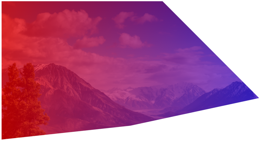
7. Clip an image
.banner {
    background-image: linear-gradient(to right, rgba(255, 0, 0, 0.70), rgba(0, 0, 255, 0.70)),url('./images/background-image.jpg');
    background-size: cover;
    background-position: top;
    height: 80vh;/*This is the ViewPort Height.*/
    clip-path: polygon(0 0, 100% 0, 100% 70%, 0 100%);/*The percentages define the coordinates in the top left, top right, bottom right, bottom left direction*/
}

.banner {
    background-image: linear-gradient(to right, rgba(255, 0, 0, 0.70), rgba(0, 0, 255, 0.70)),url('./images/background-image.jpg');
    background-size: cover;
    background-position: top;
    height: 80vh;/*This is the ViewPort Height.*/
    clip-path: polygon(0 0, 50% 0, 80% 70%, 40% 90%, 0 100%);
}
Use this tool to select any shape easily : https://bennettfeely.com/clippy/
8. Positioning an Element using the position attribute
CSS
.banner {
    background-image: linear-gradient(to right, rgba(255, 0, 0, 0.70), rgba(0, 0, 255, 0.70)),url('./images/background-image.jpg');
    background-size: cover;
    background-position: top;
    height: 80vh;/*This is the ViewPort Height.*/
    clip-path: polygon(0 0, 100% 0, 100% 70%, 0 100%);
    position: relative;
}
.logo-box {
    position: absolute;
    top: 40px;
    left: 40px;
}
HTML
        <div class="banner">
            <div class="logo-box">
                <img src="./images/logo.png" alt="Logo">

            </div>
        </div>

NOTE : The absolute position’s top.left, right, bottom attributes only take effect with respect to its parent element that has been explicitly defined as relative, and that is the .banner element in this case. If you remove the position: relative tag from the .banner class, the top and left attributes of the .logo-box class will not work anymore.
9. Positioning elements in the center or exactly where you want to
Use the position: absolute; attribute along with top, left and transform to position elements in the right place.
CSS
.banner {
    background-image: linear-gradient(to right, rgba(255, 0, 0, 0.70), rgba(0, 0, 255, 0.70)),url('./images/background-image.jpg');
    background-size: cover;
    background-position: top;
    height: 80vh;/*This is the ViewPort Height.*/
    clip-path: polygon(0 0, 100% 0, 100% 70%, 0 100%);
    position: relative;
}

.logo-box {
    position: absolute;
    top: 40px;
    left: 40px;
}

.logo {
    height: 40px;
}

.bannertext-container {
    position: absolute;
    top: 30%;
    left: 50%;
    transform: translate(-50%, -50%);
}

.bannertext-main {
    font-size: 100px;
    font-weight: 600;
    text-align: center;
    letter-spacing: 50px;
    color: white;
    text-transform: uppercase;
}

.bannertext-sub {
    font-size: 60px;
    font-weight: 400;
    text-align: center;
    letter-spacing: 10px;
    color: white;
}
HTML
        <div class="banner">
            <div class="logo-box">
                <img src="./images/logo.png" alt="Logo">
            </div>
            <div class="bannertext-container">
                <p class="bannertext-main">go vegetarian</p>
                <p class="bannertext-sub">get into the mode of healthy living</p>
            </div>
        </div>
Look how you can center the the items beautifully using the above CSS

10. Animating your HTML Elements
For animation, you need to define the @keyframes with animation names, that defines the initial, final and any intermediary steps, if any.
.bannertext-main {
    font-size: 100px;
    font-weight: 600;
    text-align: center;
    letter-spacing: 30px;
    color: white;
    text-transform: uppercase;

    /*Below two are the only required parameters for the animation to work*/
    animation-name: moveInLeft;
    animation-duration: 1s;
}

/*Look at how the initial, intermediate and final steps have been defined*/
/*Note that translateX(0) denotes the actual position of the element, translateX(-100px) instructs the element to shift left from actual position and a +ve value instructs the element to shift right*/
@keyframes moveInLeft {
    0% {
        opacity: 0;
        transform: translateX(-100px);
    }

    70% {
        transform: translateX(10px);
    }

    100% {
        opacity: 1;
        transform: translateX(0);
    }
}
Below are few other animation effects that you can explore:
    animation-delay: 2s;
    animation-iteration-count: 2;
    animation-timing-function: ease-in;
11. Pseudo Elements ::before and ::after
The ::before and ::after pseudo tags can be attached to any html element or class, and you can provide any content to add as it is before and after that class/element, as the name suggests.
CSS
.content::before {
    content: "This is the before content";
    color: red;
}
.content::after {
    content: "This is the after content";
    color: blue;
}

HTML
<div className="content">
    <p>{props.desc}</p>
    <p>{props.children}</p>
</div>
Output
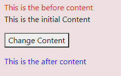
You can understand the before and after elements looking at the color.
12. Create a button press effect using transition property
If the “button” is the class of the button element, this is how you create a pressing effect of the button.
.button {
    background-color: bisque;
    color: red;
    border-radius: 50px;
    font-size: large;
    width: 200px;
    cursor: pointer;
    outline: none;
}

.button:focus {
    transition: all .2s ease-in-out; /*This specifies that the .button element tranition should take .2 seconds from its original state to the new state with transform: translateY(1px);*/
    transform: translateY(1px);
    border-radius: 50px;
    font-size: large;
    cursor: pointer;
    outline: none;
}

.button:hover {
    background-color: burlywood;
    color: black;
}
13. How to handle the side effects of float?
float is a fundamental CSS attribute that is very important to understand in order to be a good developer. float will remove the element from the DOM, and place it left or right, as mentioned (float: left | float:right). Normally if you float an element to left, and another to the right, any text or other element you try to put below those floats, will adjust in between the gaps. Here is the problem:
Look at the HTML and CSS Code for the below output
HTML
        <div class="header">
          <ul class="header__navcontainer header__navcontainer_left">
            <li class="header__navcontainer_navitem">Home</li>
            <li class="header__navcontainer_navitem">Products</li>
            <li class="header__navcontainer_navitem">Explore</li>
          </ul>
          <ul class="header__navcontainer header__navcontainer_right">
            <li class="header__navcontainer_navitem">Contact Us</li>
            <li class="header__navcontainer_navitem">Register</li>
            <li class="header__navcontainer_navitem">Login</li>
          </ul>
        </div>
        <div class="bodyContent">
        Contrary to popular belief, Lorem Ipsum is not simply random text. It has roots in a piece of classical Latin literature from 45 BC, making it over 2000 years old. Richard McClintock, a Latin professor at Hampden-Sydney College in Virginia, looked up one of the more obscure Latin words, consectetur, from a Lorem Ipsum passage, and going through the cites of the word in classical literature, discovered the undoubtable source. Lorem Ipsum comes from sections 1.10.32 and 1.10.33 of "de Finibus Bonorum et Malorum" (The Extremes of Good and Evil) by Cicero, written in 45 BC. This book is a treatise on the theory of ethics, very popular during the Renaissance. The first line of Lorem Ipsum, "Lorem ipsum dolor sit amet..", comes from a line in section 1.10.32.

The standard chunk of Lorem Ipsum used since the 1500s is reproduced below for those interested. Sections 1.10.32 and 1.10.33 from "de Finibus Bonorum et Malorum" by Cicero are also reproduced in their exact original form, accompanied by English versions from the 1914 translation by H. Rackham.
        </div>

CSS
.header {
    border: 1px solid red;

}

.header__navcontainer {
    padding: 10px;

}

.header__navcontainer_left {
    float: left;
}

.header__navcontainer_right {
    float: right;
}

.header__navcontainer_navitem {
    font-size: 2rem;
    text-decoration: none;
    list-style: none;
    display: inline-block;
    padding: 10px;
    margin:10px;
    background-color: burlywood;
    color: #fff;
}

.bodyContent {
    clear:none;
    text-align: left;
    margin-left: 20px;
    font-size: 1.5rem;
}
Now, the problem is that how to place the text below the top header buttons? You really don’t want to adjust the text in between the left and right buttons, right? For that, you can use clear:both, that clears off the left and right floats (that’s why it is both), and places the text below both the previous floats. Here is how it looks like.
The only change you need to make is to add clear:both to the .bodyContent class
.bodyContent {
    clear:both;
    text-align: left;
    margin-left: 20px;
    font-size: 1.5rem;
}
14. Create a Card using box-shadow
<!DOCTYPE html>
<html>
<head>
<style>
div.card {
  width: 250px;
  box-shadow: 0 4px 8px 0 rgba(0, 0, 0, 0.2), 0 6px 20px 0 rgba(0, 0, 0, 0.19);
  text-align: center;
}

div.header {
  background-color: #4CAF50;
  color: white;
  padding: 10px;
  font-size: 40px;
}

div.container {
  padding: 10px;
}
</style>
</head>

<body>


<div class="card">
  <div class="header">
    <h1>Mr Banerjee</h1>
  </div>

  <div class="container">
    <p>Chief Executive Officer, Concentric World</p>
  </div>
</div>

</body>
</html>
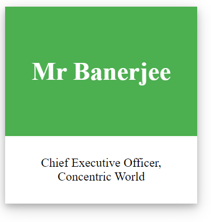
Meaning of each components of background shadow
box-shadow: [Start of Shadow Along X] [Height of Shadow along Y] [Spread of Shadow] [Background Shadow blend] [color of shadow];


2 thoughts on “Advanced CSS”