Data Visualization with Python using Seaborn and Matplotlib
Seaborn and Matplotlib are libraries used for data visualization using various graphs and plots. Let’s look at how to use these libraries for plotting step by step.
# Libraries to help with reading and manipulating data
import numpy as np
import pandas as pd

# Libraries to help with data visualization
import matplotlib.pyplot as plt
import seaborn as sns

# Command to tell Python to actually display the graphs
%matplotlib inline
To follow along, you can download the dataset CSV called Automobile.csv
df = pd.read_csv('Automobile.csv')
# df = pd.read_csv('/location on your computer/Automobile (1).csv')
df.head()
Output:
| symboling | normalized_losses | make | fuel_type | aspiration | number_of_doors | body_style | drive_wheels | engine_location | wheel_base | length | width | height | curb_weight | engine_type | number_of_cylinders | engine_size | fuel_system | bore | stroke | compression_ratio | horsepower | peak_rpm | city_mpg | highway_mpg | price | |
|---|---|---|---|---|---|---|---|---|---|---|---|---|---|---|---|---|---|---|---|---|---|---|---|---|---|---|
| 0 | 3 | 168 | alfa-romero | gas | std | two | convertible | rwd | front | 88.6 | 168.8 | 64.1 | 48.8 | 2548 | dohc | four | 130 | mpfi | 3.47 | 2.68 | 9.0 | 111 | 5000 | 21 | 27 | 13495 |
| 1 | 3 | 168 | alfa-romero | gas | std | two | convertible | rwd | front | 88.6 | 168.8 | 64.1 | 48.8 | 2548 | dohc | four | 130 | mpfi | 3.47 | 2.68 | 9.0 | 111 | 5000 | 21 | 27 | 16500 |
| 2 | 1 | 168 | alfa-romero | gas | std | two | hatchback | rwd | front | 94.5 | 171.2 | 65.5 | 52.4 | 2823 | ohcv | six | 152 | mpfi | 2.68 | 3.47 | 9.0 | 154 | 5000 | 19 | 26 | 16500 |
| 3 | 2 | 164 | audi | gas | std | four | sedan | fwd | front | 99.8 | 176.6 | 66.2 | 54.3 | 2337 | ohc | four | 109 | mpfi | 3.19 | 3.40 | 10.0 | 102 | 5500 | 24 | 30 | 13950 |
| 4 | 2 | 164 | audi | gas | std | four | sedan | 4wd | front | 99.4 | 176.6 | 66.4 | 54.3 | 2824 | ohc | five | 136 | mpfi | 3.19 | 3.40 | 8.0 | 115 | 5500 | 18 | 22 | 17450 |
df.shape
Output:
(201, 26)
- The data has 201 rows and 26 columns.
df.info()
<class 'pandas.core.frame.DataFrame'>
RangeIndex: 201 entries, 0 to 200
Data columns (total 26 columns):
 #   Column               Non-Null Count  Dtype
---  ------               --------------  -----
 0   symboling            201 non-null    int64
 1   normalized_losses    201 non-null    int64
 2   make                 201 non-null    object
 3   fuel_type            201 non-null    object
 4   aspiration           201 non-null    object
 5   number_of_doors      201 non-null    object
 6   body_style           201 non-null    object
 7   drive_wheels         201 non-null    object
 8   engine_location      201 non-null    object
 9   wheel_base           201 non-null    float64
 10  length               201 non-null    float64
 11  width                201 non-null    float64
 12  height               201 non-null    float64
 13  curb_weight          201 non-null    int64
 14  engine_type          201 non-null    object
 15  number_of_cylinders  201 non-null    object
 16  engine_size          201 non-null    int64
 17  fuel_system          201 non-null    object
 18  bore                 201 non-null    float64
 19  stroke               201 non-null    float64
 20  compression_ratio    201 non-null    float64
 21  horsepower           201 non-null    int64
 22  peak_rpm             201 non-null    int64
 23  city_mpg             201 non-null    int64
 24  highway_mpg          201 non-null    int64
 25  price                201 non-null    int64
dtypes: float64(7), int64(9), object(10)
memory usage: 41.0+ KB
- There are attributes of different types (int, float, object) in the data.
df.describe(include='all').T
---------------------------------------------------------------------------
NameError                                 Traceback (most recent call last)
<ipython-input-1-0dd56a246831> in <module>()
----> 1 df.describe(include='all').T

NameError: name 'df' is not defined
- The car price ranges from 5118 to 45400 units.
- The car weight ranges from 1488 to 4066 units.
- The most common car make in the data is of Toyota.
Histogram
- A histogram is a univariate plot which helps us understand the distribution of a continuous numerical variable.
- It breaks the range of the continuous variables into a intervals of equal length and then counts the number of observations in each interval.
- We will use the histplot() function of seaborn to create histograms.
sns.histplot(data=df, x='price')
Output:
<matplotlib.axes._subplots.AxesSubplot at 0x7fb0a65ca210>

We can specify the number of intervals (or groups or bins) to create by setting the bins parameter.
- If not specified it is passed to numpy.histogram_bin_edges()
sns.histplot(data=df, x='price', bins=5)
Output:
<matplotlib.axes._subplots.AxesSubplot at 0x7fb0a548e910>
sns.histplot(data=df, x='price', bins=20)
Output:
<matplotlib.axes._subplots.AxesSubplot at 0x7fb0a4fce4d0>
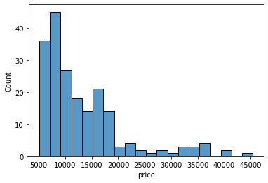
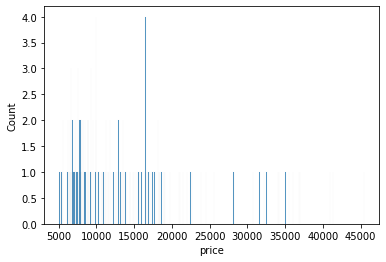
If we want to specify the width of the intervals (or groups or bins), we can use binwidth parameter.
sns.histplot(data=df, x='price', binwidth=20)
Output:
<matplotlib.axes._subplots.AxesSubplot at 0x7fb0a4ef3a90>
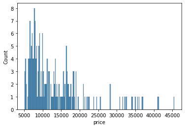
sns.histplot(data=df, x='price', binwidth=200)
Output:
<matplotlib.axes._subplots.AxesSubplot at 0x7fb0a3aa5b10>
How to find the optimal number of bins: Rule of thumb
- We calculate the bin-width first, using the following formula:binwidth=(2∗IQR)n−−⎷3where n = number of rows the dataset
- Then, we obtain bins using the calculated bin-width.bins=Rangebinwidth
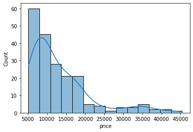
In addition to the bars, we can also add a density estimate by setting the kde parameter to True.
- Kernel Density Estimation, or KDE, visualizes the distribution of data over a continuous interval.
- The conventional scale for KDE is: Total frequency of each bin × Probability
sns.histplot(data=df, x='price', kde=True);
sns.histplot(data=df, x='price', bins=700, kde=True);
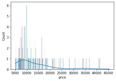
Clearly, if we increase the number of bins, it reduces the frequency count in each group (bin). Since the scale of KDE depends on the total frequency of each bin (group), the above code gives us a flattened KDE plot.
Let’s check out the histograms for a few more attributes in the data.
sns.histplot(data=df, x='curb_weight', kde=True);
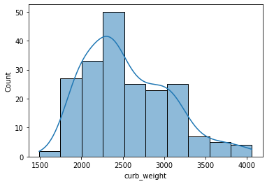
- A histogram is said to be symmetric if the left-hand and right-hand sides resemble mirror images of each other when the histogram is cut down the middle.
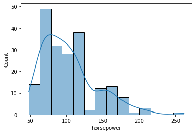
sns.histplot(data=df, x='horsepower', kde=True);

- The tallest clusters of bars, i.e., peaks, in a histogram represent the modes of the data.
- A histogram skewed to the right has a large number of occurrences on the left side of the plot and a few on the right side of the plot.
- Similarly, a histogram skewed to the left has a large number of occurrences on the right side of the plot and few on the left side of the plot.
Histograms are intuitive but it is hardly a good choice when we want to compare the distributions of several groups. For example,
sns.histplot(data=df, x='price', hue='body_style', kde=True);
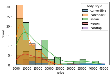
It might be better to use subplots!
g = sns.FacetGrid(df, col="body_style")
g.map(sns.histplot, "price");

In such cases, we can use boxplots. Boxplots, or box-and-whiskers plots, are an excellent way to visualize differences among groups.
Boxplot
- A boxplot, or a box-and-whisker plot, shows the distribution of numerical data and skewness through displaying the data quartiles
- It is also called a five-number summary plot, where the five-number summary includes the minimum value, first quartile, median, third quartile, and the maximum value.
- The boxplot() function of seaborn can be used to create a boxplot.
from IPython.display import Image
Image('/content/drive/MyDrive/Python Course/boxplot.png')
Output:
# creating a boxplot with seaborn
sns.boxplot(data=df, x='curb_weight');
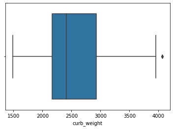
- In a boxplot, when the median is closer to the left of the box and the whisker is shorter on the left end of the box, we say that the distribution is positively skewed (skewed right).
- Similarly, when the median is closer to the right of the box and the whisker is shorter on the right end of the box, we say that the distribution is negatively skewed (skewed left).
from IPython.display import Image
Image('/content/drive/MyDrive/skew_box.png')
# Image('skew_box.png')
Output:
For example,
sns.boxplot(data=df, x='price');
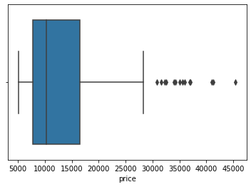
From the above plot, we can see that the distribution of price is positively skewed.
Let’s see how we can compare groups with boxplots.
sns.boxplot(data=df, x='body_style', y='price') ;
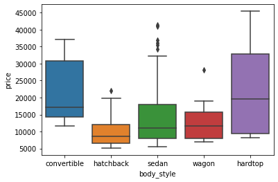
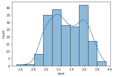
Though boxplot visually summarizes variation in large datasets, it is unable to show multimodality and clusters.
sns.boxplot(data=df, x='bore');

- From the above boxplot we can not tell if the data is bimodal or not, but it is clearly visible in the following histogram.
sns.histplot(data=df, x='bore',kde = True);
Bar Graph
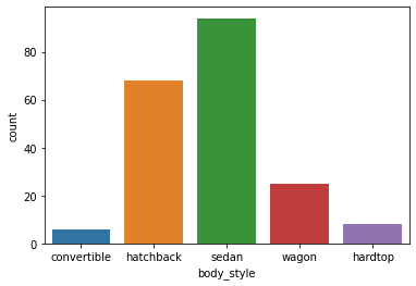
- A bar graph is generally used to show the counts of observations in each bin (or level or group) of categorical variable using bars.
- We can use the countplot() function of seaborn to plot a bar graph.
sns.countplot(data=df, x='body_style');
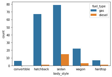
We can also make the plot more granular by specifying the hue parameter to display counts for subgroups.
sns.countplot(data=df, x='body_style', hue='fuel_type');
Let’s check out the bar graphs for a few more attributes in the data.
sns.countplot(data=df, x='make');
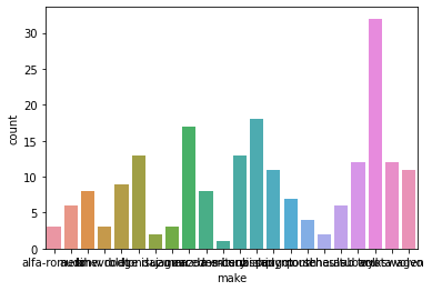
- This plot looks a little messy and congested.
- Let’s increase the size of the plot to make it look better.
plt.figure(figsize=(20,7))
sns.countplot(data=df, x='make');
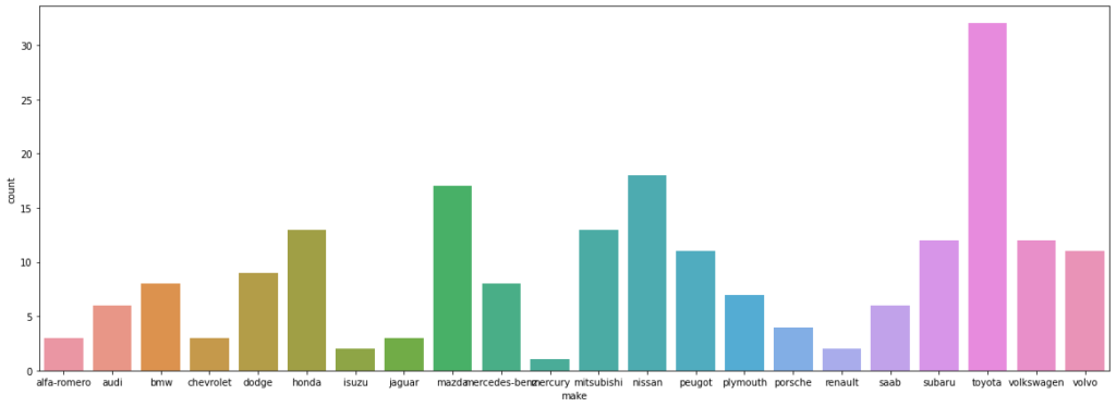
- Some of the tick marks on the x-axis are overlapping with each other.
- Let’s rotate the tick marks to make it look better.
plt.figure(figsize=(20,7))
sns.countplot(data=df, x='make')
plt.xticks(rotation=90)
Output:
(array([ 0,  1,  2,  3,  4,  5,  6,  7,  8,  9, 10, 11, 12, 13, 14, 15, 16,
        17, 18, 19, 20, 21]), <a list of 22 Text major ticklabel objects>)
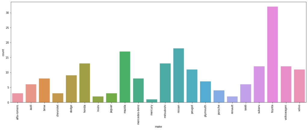
- A lot of plot-specific text has shown up in the output.
- Let’s see how we can get rid of those.
plt.figure(figsize=(20,7))
sns.countplot(data=df, x='make')
plt.xticks(rotation=90)
plt.show() # this will ensure that the plot is displayed without the text

Customizing plots
- In this section we will see how we can customize plots by using different matplotlib and seaborn functions.
To change the axis scales of a plot:
    plt.xlim(left, right)   # here left and right indicates the min and the max limits of  x-axis respectively
    plt.ylim(bottom, top)   # here bottom and top indicates the min and the max limits of  y-axis respectively
To change the plot title and axis labels:
    plt.title()
    plt.xlabel()   # for x_axis labels
    plt.ylabel()   # for y_axis labels
To show the grid lines of a plot:
    sns.set(style="darkgrid")
    sns.set(style="whitegrid")
    sns.set(style="white")
To hide the axes of a plot:
plt.axis('off') # it will hide both the x-axis and y-axisTo customize labels of the plot legend:
ax.legend([]) # takes list of the legend valuesTo change the position of the plot legend:
plt.legend(loc=___)The following values can be added to loc to change the location of the legend:
- ‘upper left’, ‘upper right’, ‘lower left’, ‘lower right’, ‘center’, ‘best’, etc.
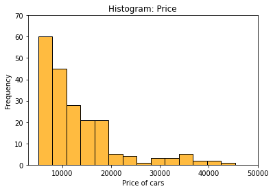
Let’s see how we can customize a histogram.
plt.title('Histogram: Price')
plt.xlim(3000,50000)
plt.ylim(0,70)
plt.xlabel('Price of cars')
plt.ylabel('Frequency')
sns.histplot(data=df, x='price', color='orange');
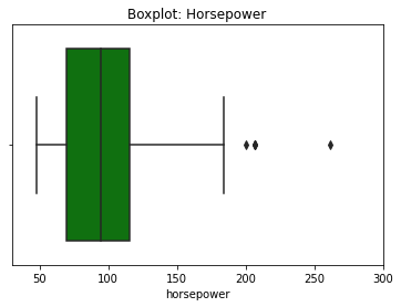
Let’s see how we can customize a boxplot
plt.title('Boxplot: Horsepower')
plt.xlim(30,300)
plt.xlabel('Horsepower')
sns.axes_style('whitegrid')
sns.boxplot(data=df, x='horsepower', color='green');
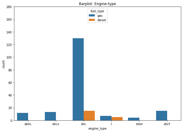
We can further customize the barplot as follows.
plt.figure(figsize=(10,7))
plt.title('Barplot: Engine-type')
plt.ylim(0,180)
plt.xlabel('Engine-type')
sns.countplot(data=df, x='engine_type', hue='fuel_type');
Lineplot
Suppose, your dataset has multiple y values for each x value. A lineplot is a great way to visualize this. This type of data often shows up when we have data that evolves over time, for example, when we have monthly data over several years. If we want to compare the individual months, then a line plot is a great option. This is sometimes called seasonality analysis.
from IPython.display import Image
Image('/content/drive/MyDrive/Python Course/Line_plot.png')
Output:
- A line plot uses straight lines to connect individual data points to display a trend or pattern in the data.
- For example, seasonal effects and large changes over time.
- The lineplot() function of seaborn, by default, aggregates over multiple y values at each value of x and uses an estimate of the central tendency for the plot.
- lineplot() assumes that you are most often trying to draw y as a function of x. So, by default, it sorts the data by the x values before plotting.
# loading one of the example datasets available in seaborn
flights = sns.load_dataset("flights")

# creating a line plot
sns.lineplot(data = flights , x = 'month' , y = 'passengers');
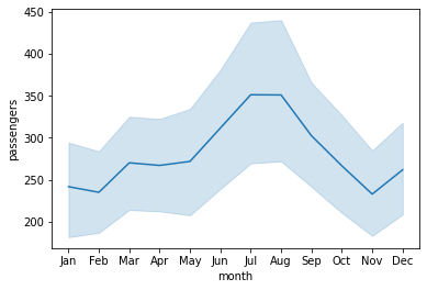
- The light blue shaded area is actually the ‘confidence interval‘ of the y-value estimates for each x-axis value.
- The confidence interval is a range of values around that estimate that are believed to contain the true value of that estimate with a certain probability.
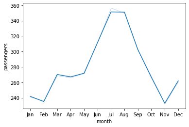
We can switch off the confidence intervals by setting the ci parameter to ‘False’.
sns.lineplot(data=flights , x='month' , y='passengers', ci=False);
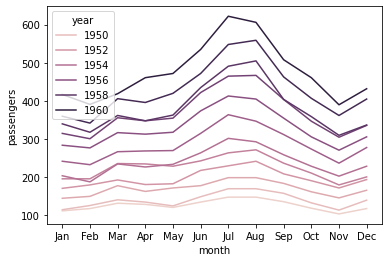
We can also check the relationship between two variables for different categories by specifying the hue parameter.
sns.lineplot(data=flights, x='month', y='passengers', ci=False, hue='year');
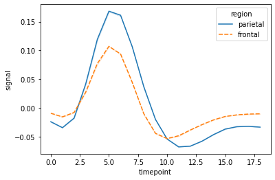
We can change the style of the lines by adding ‘style’ parameter to the function.
# loading one of the example datasets available in seaborn
fmri = sns.load_dataset("fmri")

# creating the line plot
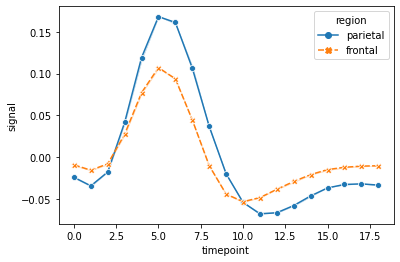
sns.lineplot(data=fmri, x="timepoint", y="signal", hue="region", style="region", ci=False);
We can also add markers at each observation to identify groups in a better way.
sns.lineplot(data=fmri, x="timepoint", y="signal", hue="region", style="region", ci=False, markers=True);
Let’s customize the lineplot for a better visualization.
plt.figure(figsize = (15,7))
sns.lineplot(data = flights , x = 'month' , y = 'passengers', hue = 'year')
plt.ylabel('Number of Passengers')
plt.legend(bbox_to_anchor=[1, 1]); #another way to change the legend's location in the plot
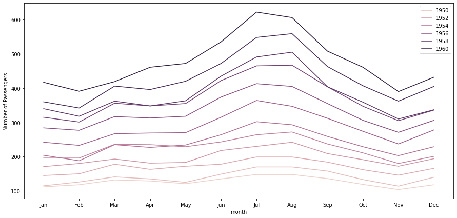
- Note that, unlike barplots and histograms, line plots may not include a zero baseline.
- We create a line chart is to emphasize changes in value, rather than the magnitude of the values themselves, and hence, a zero line is not meaningful.
Scatterplot
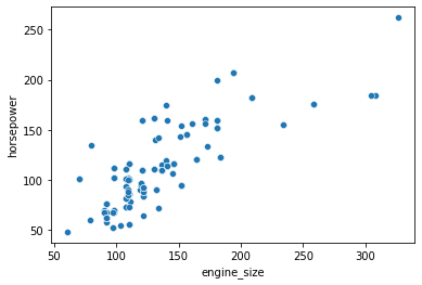
Sometimes we want to know if two variables mean something when put together, whether a small change in one variable affects the other variable. In such cases, plotting a scatterplot, or scatter-diagram, with our data points can help us to check whether there is a potential relationship between them.
- A scatterplot is the simplest mode of a diagrammatic representation of two variables.
- It takes two perpendicular axes of coordinates, one for x and one for y.
- Unlike the lineplot, it directly plots each pair of values as a point on the 2D space.
- The scatterplot() function of seaborn can be used to make a scatterplot.
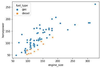
sns.scatterplot(data=df, x='engine_size', y='horsepower');
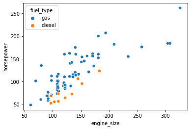
We can also check the relationship between two variables for different categories by specifying the hue parameter.
sns.scatterplot(data=df, x='engine_size', y='horsepower', hue='fuel_type');
We can assign the same variable as hue to another parameter style which will vary the markers and create a more readable plot.
sns.scatterplot(data=df, x='engine_size', y='horsepower', hue='fuel_type', style='fuel_type');
Correlation
Correlation means association. More precisely, it expresses the extent to which two variables change together at a constant rate.
- In a scatter plot when the y variable tends to increase as the x variable increases, we say there is a positive correlation between the variables.
- Again, when the y variable tends to decrease as the x variable increases, we say there is a negative correlation between the variables.
- If the points on the scatter plot seem to be scattered randomly, we say that there is no correlation between the variables.
Let’s check out the relationship between a few more variables using scatter plots.
sns.scatterplot(data=df, x='curb_weight', y='engine_size');
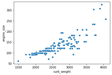
From the above plot, we can say that these variables are positively correlated.
sns.scatterplot(data=df, x='bore', y='stroke');
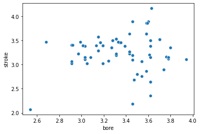
- From the above plot, it is clear that the variables have no correlation.
Note:
- A strong correlation will have data points close together, while a weak correlation will have data points that are further apart.
- We can not measure the relationship quantitatively using a scatter plot. It just gives an expression for the relative change between the variables.
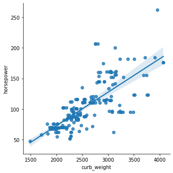
We can see from the scatterplot of engine_size vs horsepower that there is a positive correlation between the two variables. Now, we want to measure the relationship between these two variables quantitatively and try to predict the ‘horsepower‘ based on ‘engine size‘. This can be easily done by fitting a linear model. Here comes the seaborn lmplot() function to help us with that.
lmplot
- The lmplot() function plots a scatterplot and also fit a linear model with a confidence interval for the fitted model.
sns.lmplot(data=df, x='curb_weight', y='horsepower');
We can also check the relationship between two variables for different categories by specifying the hue parameter.
sns.lmplot(data=df, x='curb_weight', y='horsepower', hue='fuel_type',ci=False);
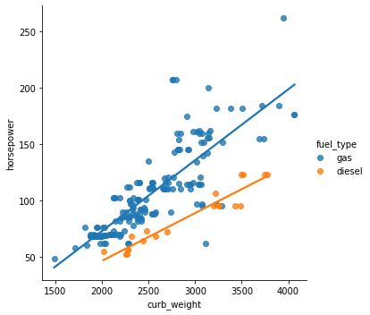
We can also disable the 95% confidence interval and just keep the regression model fit by setting the ci parameter to False.
sns.lmplot(data=df, x='curb_weight', y='horsepower', ci=False);
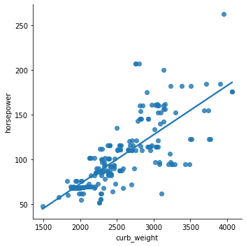
We can also plot the levels of the third variable across different plots.
sns.lmplot(data=df, x='curb_weight', y='horsepower', col='fuel_type');
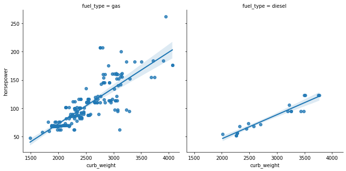
Let’s check out the relationship between a few more variables using lmplot().
sns.lmplot(data=df, x='curb_weight', y='engine_size', col='number_of_doors', ci=False)
Output:
<seaborn.axisgrid.FacetGrid at 0x7fb0a1355890>

sns.lmplot(data=df, x='horsepower', y='price', ci=False);
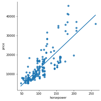
We have seen that histograms help us understand the distribution of individual variables and scatterplots help us identify the relationship between two variables. While we can view and analyze these plots separately, having them together in a single visualization would allow us to capture a lot more information in a concise manner. That’s where a jointplot comes to our aid.
Joint plot
- A jointplot helps to quickly visualize the bivariate and univariate profiles on the same plot.
- It comprises three plots – one displays the relationship between two variables while the other two show the individual distribution of each variable in the margins.
- The jointplot() function of seaborn can be used to create a jointplot.
sns.jointplot(data=df, x='engine_size', y='horsepower');
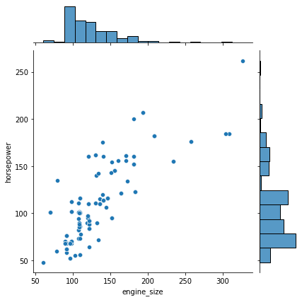
- By default, jointplot() creates a scatter plot to show the relationship between two variables and individual histograms are created in x and y axis margins for each of the variables.
One of the drawbacks of scatterplots is the overlapping of points. When we have large volumes of data to plot, the data points in the plot overlap with each other, making it difficult to interpret the data.
In such cases, we can divide the entire plot into bins using different shapes (square, triangle, hexagon, etc.) and then try to see the number of data points falling within each of the bins.
seaborn’s jointplot() provides a ‘hex‘ kind to plot the data in above-mentioned way.
We can create a hexbin plot by setting kind=”hex”.
- It actually splits the plotting window into several hexagons and the colour of each hexagon denotes the number of data points in it.
sns.jointplot(data=df, x='engine_size', y='horsepower', kind="hex");
plt.colorbar(); # adds a separate axis indicating the color scale in this plot
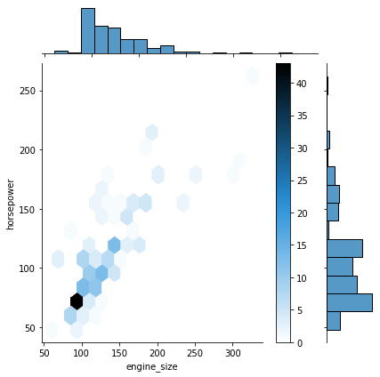
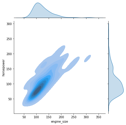
We can also create a kde plot by setting kind=”kde”..
- A KDE jointplot also uses color to determine where observations are the most dense.
- It creates a continuous plot using probabilities of new data should be introduced.
sns.jointplot(data=df, x='engine_size', y='horsepower', kind="kde", fill=True);
Let’s check out the joint plots for a few more attributes in the data.
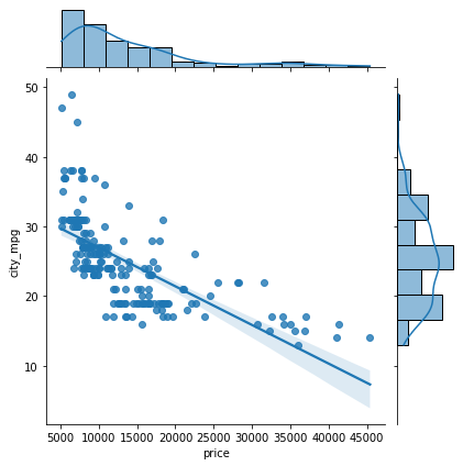
- By using kind = “reg”, we can use the joint point to find the best line or curve that fits the plot.
sns.jointplot(data=df, x='price', y='city_mpg', kind="reg");
Violin Plot
- A violin plot allows us to visualize the distribution of a numeric variable for several groups.
- It is similar to boxplot but with a rotated plot on each side, giving more information about the density estimate on the y-axis.
- The violinplot() function of seaborn can be used to make a violin plot.
sns.violinplot(data=df, x='horsepower');
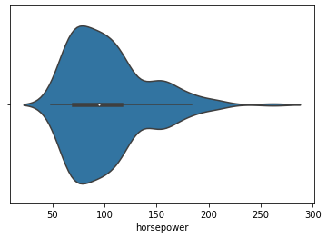
- The white dot in the plot represents the median.
- The thick gray bar in the center represents the interquartile range.
- The wider section of the violin plot represents a higher probability and the skinnier sections represent a lower probability for the given value.
We can get a vertical plot by setting orient parameter to ‘v’ and assigning a numeric variable to the y-axis.
sns.violinplot(data=df, x='fuel_type', y='horsepower', orient='v');

Let’s check out the violinplots for a few more attributes in the data.
sns.violinplot(data=df, x='engine_size', y='fuel_type');
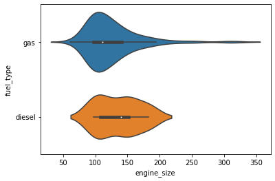
We can use the palette parameter to change the colour palette.
- seaborn has six variations of it – deep, muted, pastel, bright, dark, colorblind.
sns.violinplot(data=df, x='body_style', y='engine_size', palette="bright");
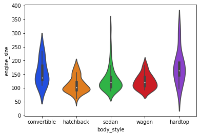
sns.violinplot(data=df, x='engine_location', y='price', palette="colorblind");
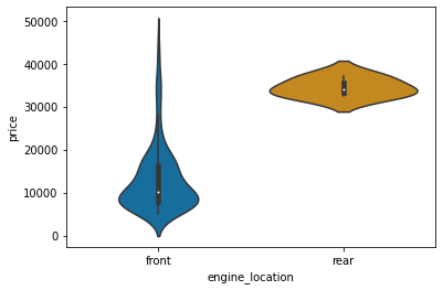
Histograms and other distribution plots are typically preferred for larger data sets. When we have a small dataset and we want to visualize the frequency distribution, a strip plot can be used.
Strip Plot
- A strip plot is basically a scatter plot that differentiates different categories.
- The stripplot() function of seaborn can be used to make a strip plot.
sns.stripplot(data=df, x='engine_size');
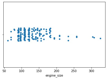
Strip plots are considered a good alternative to a box plot or a violin plot for comparing data distributions when we have fewer data points.
plt.figure(figsize=(15,7))
sns.stripplot(data=df, x='body_style', y='engine_size');
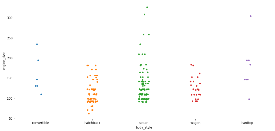
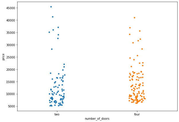
Strip plots are more useful when we add random noise called “jitter” to avoid overlapping of data points with same values.
plt.figure(figsize=(20,7))
sns.stripplot(data=df, x='body_style', y='engine_size', jitter=True);
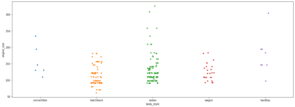
We can set the hue parameter to display observations for subgroups.
plt.figure(figsize=(10,7))
sns.stripplot(data=df, x='fuel_type', y='engine_size', hue="number_of_doors", jitter=True);
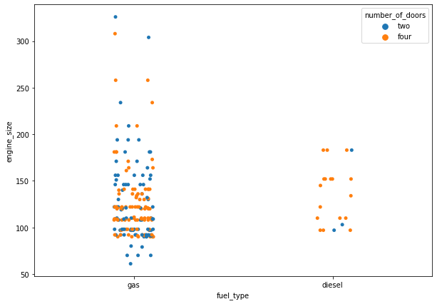
Let’s check out the strip plots for a few more attributes in the data.
plt.figure(figsize=(10,7))
sns.stripplot(data=df, x='number_of_doors', y='price',jitter=True);
plt.figure(figsize=(10,7))
sns.stripplot(data=df, x='number_of_doors', y='horsepower', jitter=True);
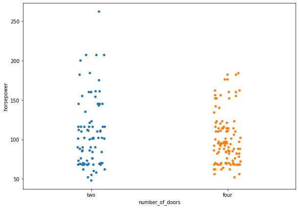
In a strip plot, dots are randomly arranged in vertical direction, which means we can not use the width to estimate distribution. This can be easily done by swarm plots.
Swarm Plot
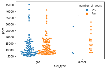
- A swarm plot is very similar to the strip plot, but it avoids the overlapping of points.
- The swarmplot( ) function of seaborn can be used to create such a graph for categorical values.
sns.swarmplot(data=df, x='number_of_doors', y='price');
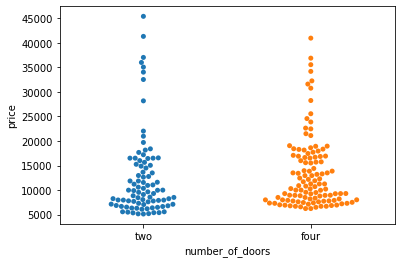
- In a swarm plot, dots are arranged in vertical columns.
- So, we can estimate the distribution of our data by looking at the width of the plot.
We can add the hue parameter to swarmplot() and separate the categories.
sns.swarmplot(data=df, x='fuel_type', y='price', hue='number_of_doors');
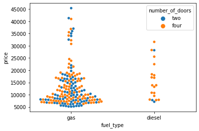
We can split the two products setting the dodge argument to True.
sns.swarmplot(data=df, x='fuel_type', y='price', hue='number_of_doors', dodge=True);
Catplot
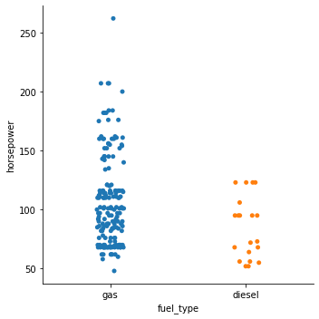
- The catplot() function provides a new framework giving access to several types of plots that show relationship between numerical variable and one or more categorical variables.
- Catplots supports 8 different plots including stripplot(), swarmplot(), boxplot() and more, with the default kind being ‘strip’.
sns.catplot(data=df, x='fuel_type', y='horsepower');
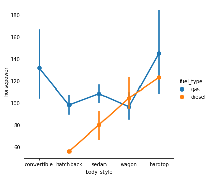
We can set kind=’point’ to create a pointplot using the catplot() function.
- A pointplot helps us to see how the main relationship is changing as a function of the second variable.
sns.catplot(data=df, x='body_style', y='horsepower', hue='fuel_type', kind='point');
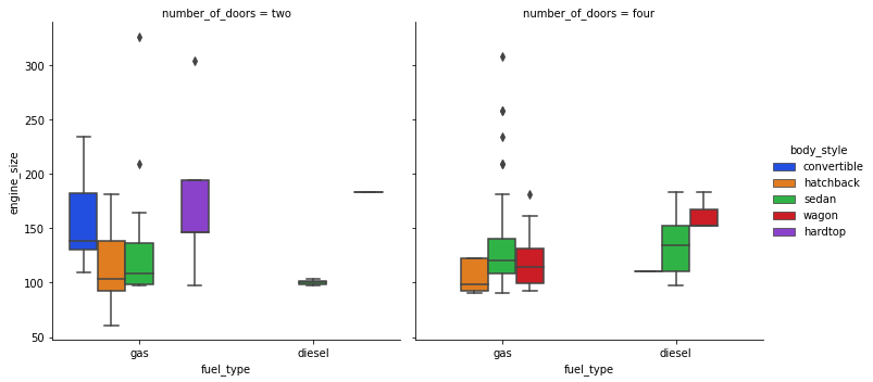
Catplot is very useful to draw categorical plots onto a FacetGrid by assigning a third variable to the col parameter.
sns.catplot(data=df, x="fuel_type", y="horsepower", hue="number_of_doors", col="drive_wheels", kind='bar', palette='pastel');

Let’s check out the catplot() function for a few more attributes in the data.
sns.catplot(data=df, x="fuel_type", y="engine_size", hue="body_style", col="number_of_doors", kind='box', palette='bright');
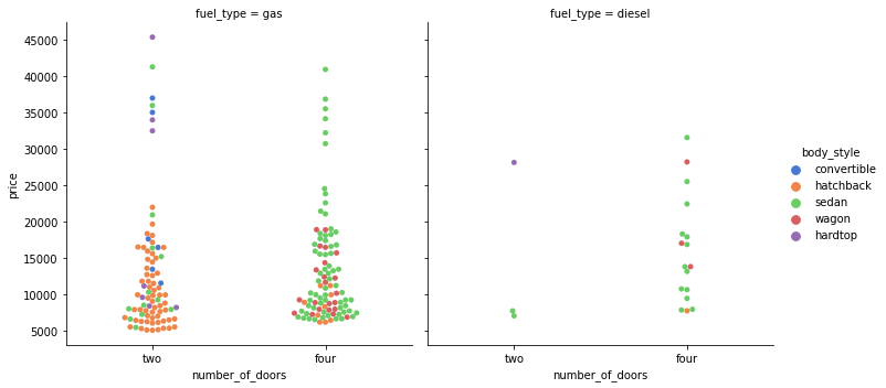
sns.catplot(data=df, x="number_of_doors", y="price", hue="body_style", col="fuel_type", kind='swarm', palette='muted');
Pair Plot
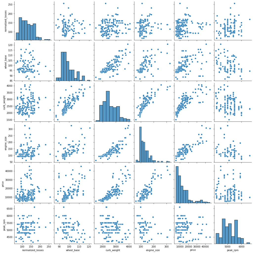
- A pairplot shows the relationship between two numeric variables for each pair of columns in the dataset.
- It creates a grid of axes such that each variable in data will be shared in the y-axis across a single row and in the x-axis across a single column.
- The pairplot() function of seaborn can be used to create such a plot.
sns.pairplot(data=df[['normalized_losses','wheel_base','curb_weight','engine_size','price','peak_rpm']])
Output:
<seaborn.axisgrid.PairGrid at 0x7fb098108690>
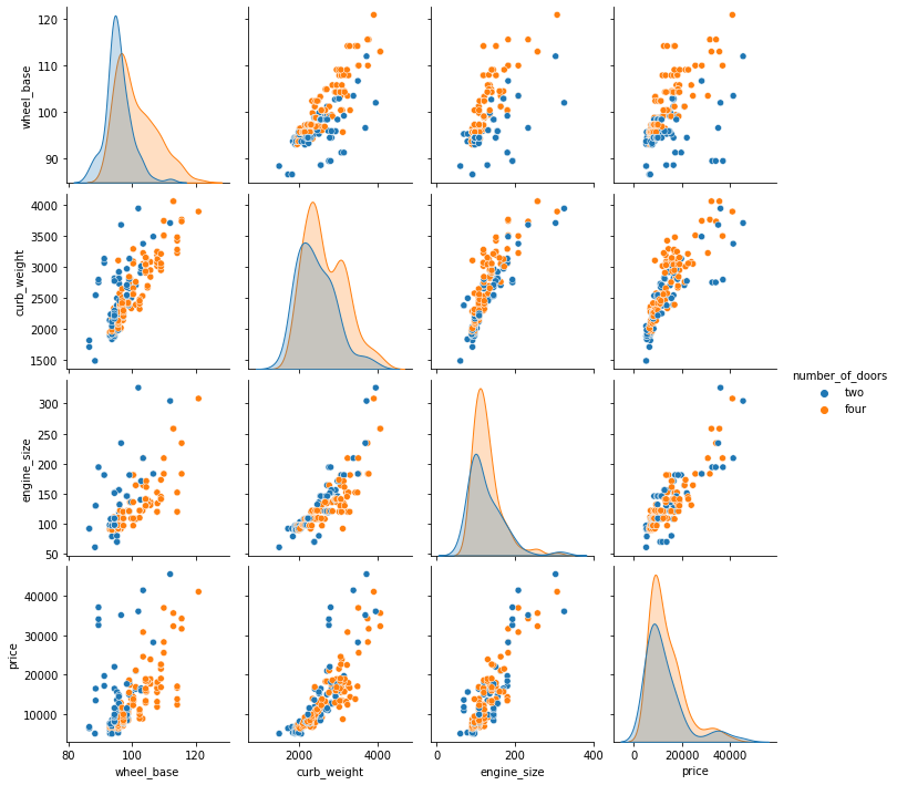
We can add the hue parameter in pairplot to create a semantic mapping.
- It changes the default marginal plot to a layered kde plot.
Also, we can add vars parameter to assign a list of variables from the dataset for which we want to create the pairplot.
sns.pairplot(data=df, vars=['wheel_base', 'curb_weight', 'engine_size', 'price'], hue='number_of_doors');
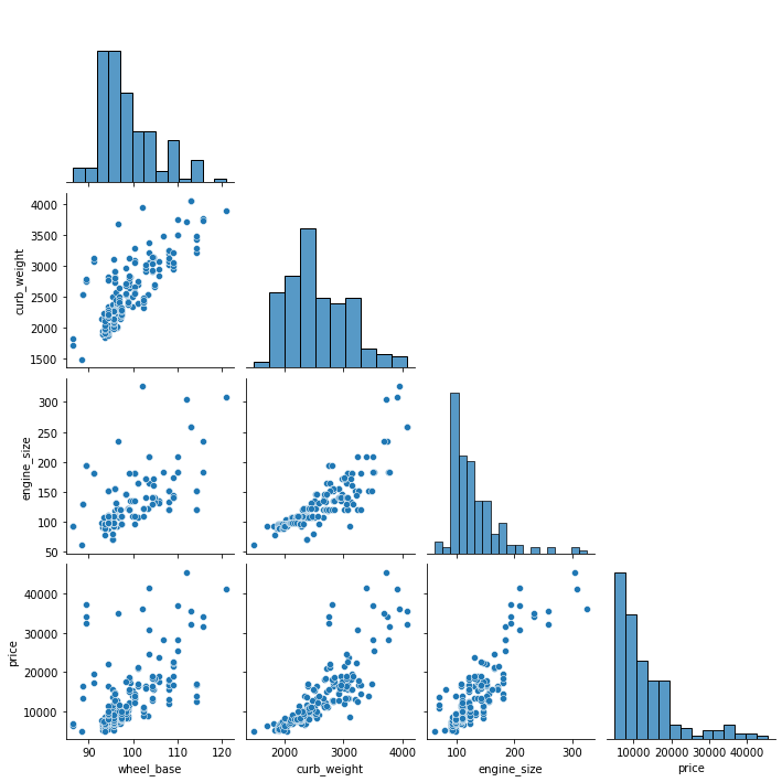
We can set corner=True to plot only the lower triangle of a pairplot.
sns.pairplot(data=df, vars=['wheel_base', 'curb_weight', 'engine_size', 'price'], corner=True);
Heatmap
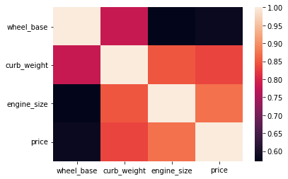
- A heatmap is a graphical representation of data as a color-encoded matrix.
- It is a great way of representing the correlation for each pair of columns in the data.
- The heatmap() function of seaborn helps us to create such a plot.
sns.heatmap(data=df[['wheel_base','curb_weight','engine_size','price']].corr());
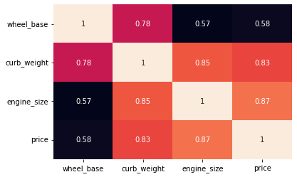
We can set the annot parameter to True for displaying the numeric value in each cell.
- To remove the color bar, the cbar parameter can be set to False.
sns.heatmap(data=df[['wheel_base','curb_weight','engine_size','price']].corr(), annot=True, cbar=False);
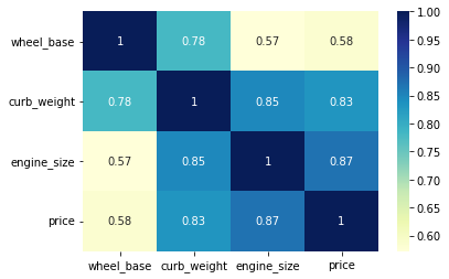
We can apply a different colormap with the cmap parameter for better visual appeal.
sns.heatmap(data=df[['wheel_base','curb_weight','engine_size','price']].corr(), annot=True, cmap='YlGnBu');
Plotly
- Plotly is an open-source Python graphing library for building beautiful and interactive visualizations.
# let's start by installing plotly
!pip install plotly
Requirement already satisfied: plotly in /usr/local/lib/python3.7/dist-packages (4.4.1)
Requirement already satisfied: six in /usr/local/lib/python3.7/dist-packages (from plotly) (1.15.0)
Requirement already satisfied: retrying>=1.3.3 in /usr/local/lib/python3.7/dist-packages (from plotly) (1.3.3)
# importing plotly
import plotly.express as px
Histogram
his = px.histogram(df, x="price")
his.show()
Bar Plot
bar = px.bar(df, x='peak_rpm', y='horsepower')
bar.show()
Scatter Plot
scat = px.scatter(df, x='price', y='engine_size')
scat.show()
Boxplot with underlying data
fig = px.box(df, x="fuel_type", y="horsepower", points="all")
fig.show()
3D Scatter Plot
fig_3d = px.scatter_3d(df, x='fuel_type', y='horsepower', z='price', color='horsepower')
fig_3d.show()
# to save the output to an HTML file
fig_3d.write_html("scatter_3d.html")