Develop iOS and Android Apps using React Native
React Native is used to develop iOS and Android Apps with the same code base. Before the advent of React Native, it required multiple development efforts to develop apps in iOS and Android. Let’s look at the quick steps to get started and acquire medium level of proficiency with React Native.
1. Get started with React Native
Step 1. Download NodeJS using this link
Step2. Download Expo Go from AppStore or Expo from Playstore. This helps to test the app using your mobile device.
Note: Expo CLI takes a lot of complexity from React Native and acts as a layer between your code and React Native to provide a convenient development environment for you
Step3. Install expo client npm package. It is a wrapper that helps with the React Native development.
npm install --global expo-cli
Step 4. Create the application
expo init my-project
Note: Choose the Blank project while initiating a new project. This helps to generate the basic code to start with. Also note that the above step will create a server and open up below expo console in browser.
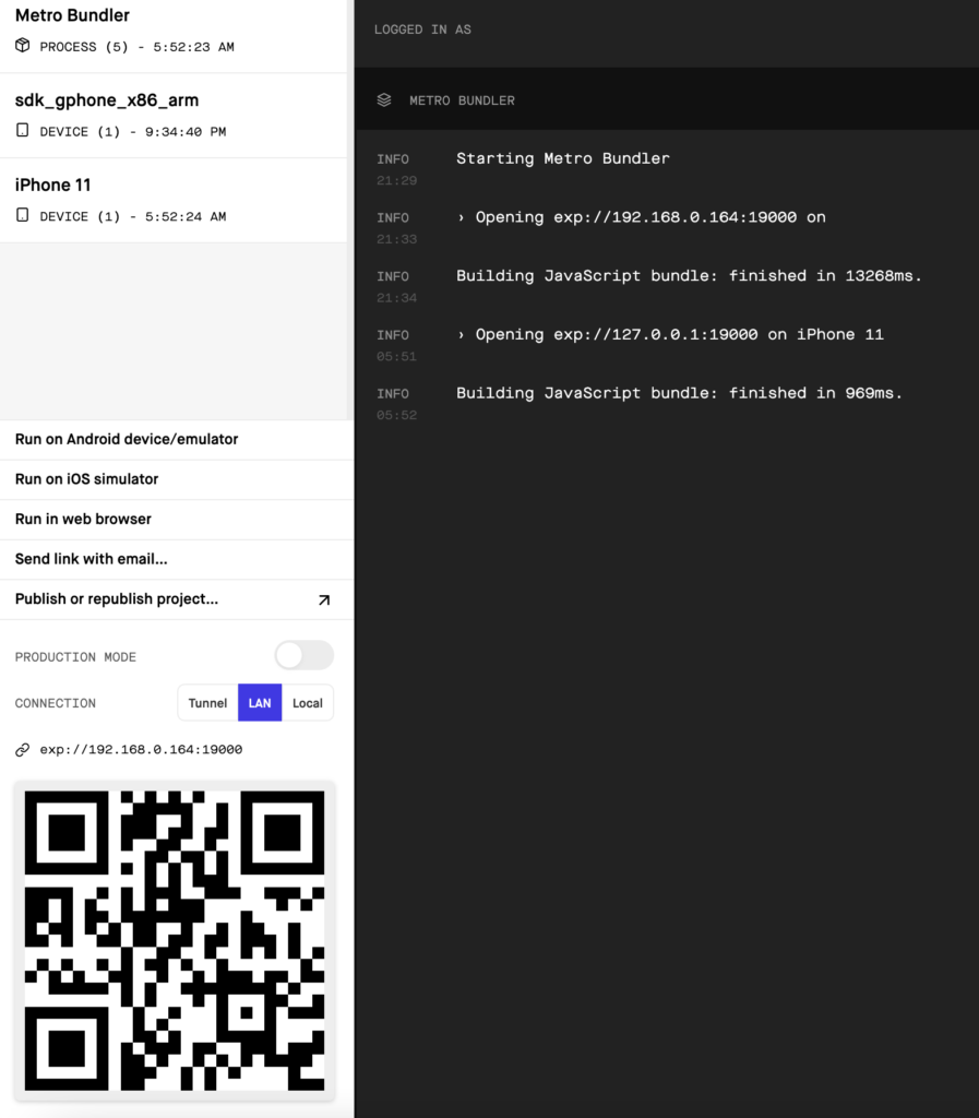
In case the application is already created, just run below command to start the above interface.
expo start
Step 5. Connect your apple or android device, and scan the above QR code to run the demo app in your device.
2. Working with Simulators
Step 1. To use simulators, you need to download Android Studio for Android Apps or Xcode for iOS Apps. Note that Xcode can be only downloaded in Mac, but Android Studio is supported in both Windows and Mac.
Step 2. For Android Studio, navigate to Tools -> AVD Manager to open up the Virtual Device Manager. From there, you can download and run simulators of any version.
Step 3. For Xcode, navigate to Xcode -> Open Developer Tools -> Simulator to open up the Simulator.
Step 4. Once Simulator is open, use with the below options in the expo dev tool to run your app in the simulators. Another option is to enter ‘i’ or ‘a’ in the expo server console, and it will open up the iOS or the Android Simulator respectively.

3. React Native Basic Tags
Get the list of Tags in React Native here
a. Everything should be placed under <View></View>
b. There can be multiple <View></View> components
c. You can build your own custom components using the core ones provided by React Native
d. Few core components are given below.
| Component | Usage | Example |
| <Text> | Display text | <View> <Text>Hello World</Text> </View> |
| <TextInput> | Accept User Input | <View> <TextInput placeholder=”Customer Name” /> </View> |
4. Styles in React Native
React native doesn’t understand the CSS styles, exactly as understood by a browser. However, the styles are similar.
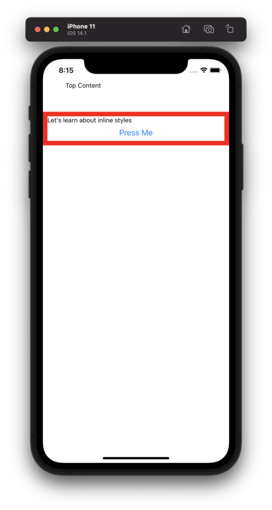
a. Inline Styles
import React from 'react';
import { Text, View, Button, TextInput } from 'react-native';

export default function App() {

  return (
    <View>
      <Text style={{
        padding: 50
      }}>Top Content</Text>
      <View style={{
        borderColor: 'red',
        borderWidth: '10'
      }}>
        <Text>Let's learn about inline styles</Text>
        <Button title='Press Me'/>
      </View>
    </View>
  );
}
b. External Styles
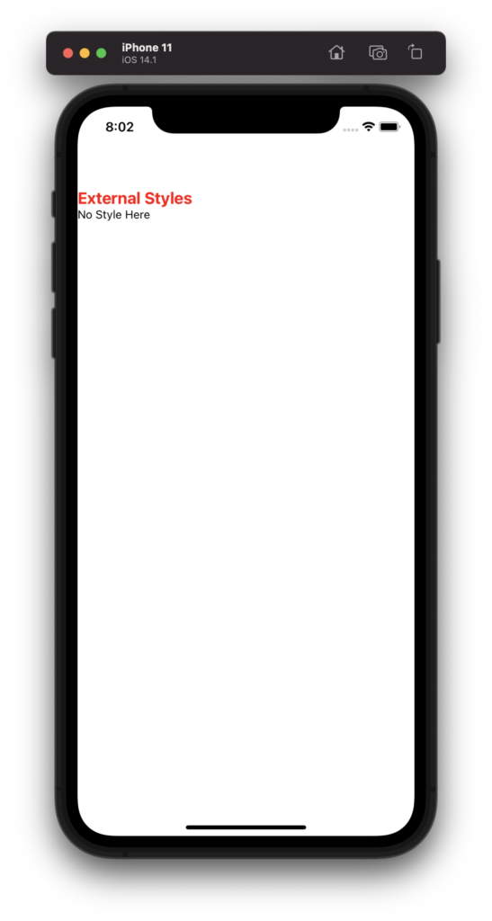
External Styles using the StyleSheet object is more popular since this adds CSS validation and better runtime performance.
import React from 'react';
import { StyleSheet, Text, View, Button, TextInput } from 'react-native';

export default function App() {

  const customStyleObj = StyleSheet.create({
    container: {
      fontSize: 20,
      color: 'red',
      marginTop: 100,
      fontWeight: 'bold'
    }
  })

  return (
    <View>
      <View>
        <Text style={customStyleObj.container}>External Styles</Text>
      </View>
      <Text>No Style Here</Text>
    </View>
  );
}
5. Arranging objects using inbuilt styling parameters
a. Center an element
import React from 'react';
import { StyleSheet, Text, View, Button, TextInput } from 'react-native';
import Styles from './Utilities/CustomStyles';

export default function App() {

  const customStyleObj = StyleSheet.create({
    centerElement: {
      justifyContent: 'center',
      alignItems: 'center',
      flexDirection: 'row',
      marginTop: 300
    },
    heading: {
      fontSize: 50,
      fontWeight: 'bold'
    }
  })

  return (
    <View>
      <View style={customStyleObj.centerElement}>
        <Text style={customStyleObj.heading}>Top Content</Text>
      </View>
    </View>
  );
}
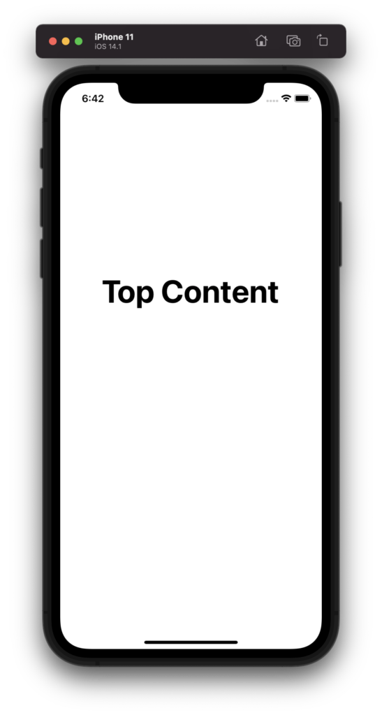
The key styling parameters to center an object are flexDirection, justifyContent and alignItems.
flexDirection – It can be either ‘row’ or column. The latter is the default, where objects are placed vertically. For ‘row’, objects are placed horizontally.
justifyContent – For a defined flexDirection, this parameter places the objects according to the value of this parameter along the defined flexDirection axis. For example, if flexDirection is ‘row’ and justifyContent is ‘center’, the objects are placed at the center of the <View> along the horizontal axis.
alignItems – This places the objects along the cross axis, as opposed to justifyContent. For example, if flexDirection is ‘row’, then alignItems governs how to place the objects vertically.
b. Combining multiple styles in a singe object
You can assign multiple StyleSheet parameters to a View object as object of array.
<Text style={[customStyleObj.heading, customStyleObj.header1]}>1</Text>
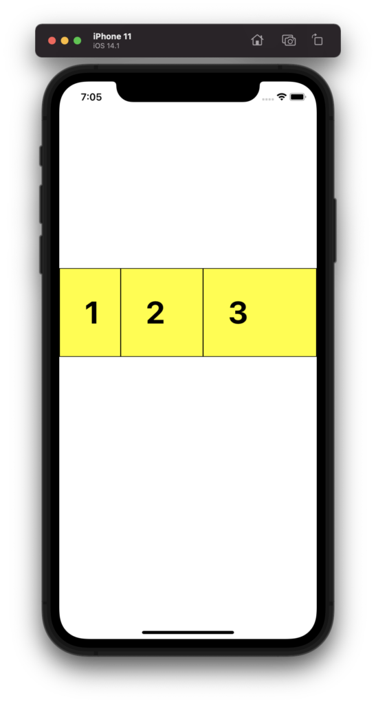
c. Managing ratio of content space using flex
To control the ratio of space allocated to View objects which are part of a common parent View, you need to use flex parameter in the sub-Views.
import React from 'react';
import { StyleSheet, Text, View, Button, TextInput } from 'react-native';
import Styles from './Utilities/CustomStyles';

export default function App() {

  const customStyleObj = StyleSheet.create({
    centerElement: {
      justifyContent: 'center',
      alignItems: 'center',
      flexDirection: 'row',
      marginTop: 300,
      backgroundColor: 'red'
    },
    heading: {
      fontSize: 50,
      fontWeight: 'bold',
      backgroundColor: 'yellow',
      borderWidth: 1,
      padding: 40
    },
    header1: {
      flex: 1
    },
    header2: {
      flex: 3
    },
    header3: {
      flex: 6
    }
  })

  return (
    <View>
      <View style={customStyleObj.centerElement}>
        <Text style={[customStyleObj.heading, customStyleObj.header1]}>1</Text>
        <Text style={[customStyleObj.heading, customStyleObj.header2]}>2</Text>
        <Text style={[customStyleObj.heading, customStyleObj.header3]}>3</Text>
      </View>
    </View>
  );
}
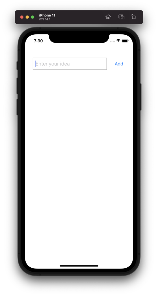
d. Create a sample screen with TextInput and Button, placed side by side
import React from 'react';
import { StyleSheet, Text, View, Button, TextInput } from 'react-native';
import Styles from './Utilities/CustomStyles';

export default function App() {

  const customStyleObj = StyleSheet.create({
    topSpace: {
      marginTop: 80
    },
    centerElementRow: {
      justifyContent: 'space-between',
      alignItems: 'center',
      flexDirection: 'row',
      margin: 20,
      padding: 10
    },
    textInput: {
      width: '80%',
      borderColor: 'grey',
      borderWidth: 0.5,
      fontSize: 20,
      padding: 10
    }

  })

  return (
    <View>
      <View style={[customStyleObj.topSpace, customStyleObj.centerElementRow]} >
      <TextInput placeholder='Enter your idea' style={customStyleObj.textInput}></TextInput>
      <Button title='Add'></Button>
      </View>
    </View>
  );
}
6. Adding Action to Buttons
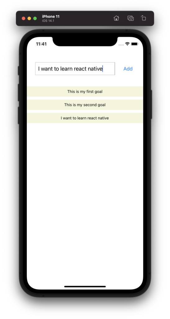
You can add onPress attribute of the Button Object to declare the function or action to be called when the button is pressed. For example, in the above screen, if we want to declare the Add button to create our goals, that is entered in the TextInput, and display as a list in the area below, we need to declare a state variable, as done in regular react code, and update the value of the state in the onPress action of the button.
import React, { useState } from 'react';
import { StyleSheet, Text, View, Button, TextInput } from 'react-native';

export default function App() {

//state variable for entered goal
  const [goalInput, setGoalInput] = useState('')

//state array variable to store all goals entered
  const [goalsArray, setGoalsArray] = useState([])

//function that is called when Add button pressed
  const addGoal = () => {
    const cumulativeGoals = [...goalsArray, goalInput]
    setGoalsArray(cumulativeGoals)
  }

  const customStyleObj = StyleSheet.create({
    topSpace: {
      marginTop: 80
    },
    centerElementRow: {
      justifyContent: 'space-between',
      alignItems: 'center',
      flexDirection: 'row',
      margin: 20,
      padding: 10
    },
    textInput: {
      width: '80%',
      borderColor: 'grey',
      borderWidth: 0.5,
      fontSize: 20,
      padding: 10
    },
    goalsList: {
      flexDirection: 'row',
      justifyContent: 'center',
      alignItems: 'center',
      padding: 10,
      backgroundColor: '#f5f5dc',
      marginTop: 10
    }

  })

  return (
    <View>
      <View style={[customStyleObj.topSpace, customStyleObj.centerElementRow]} >
      <TextInput placeholder='Enter your idea' style={customStyleObj.textInput} onChangeText={(enteredText) => setGoalInput(enteredText)}
      value={goalInput}></TextInput>
      <Button title='Add' onPress={addGoal}></Button>
      </View>

      {
        /*
          Displat the array of goals as a vertical list
        */
      }

      <View style={{marginBottom: 10}}>
        {goalsArray.map((value, index) => {
          return (
            <View style={customStyleObj.goalsList} key={Math.random().toString()}>
                <Text>{value}</Text>
            </View>
          )
        })}
      </View>
    </View>
  );
}
7. Creating a scrollable list
a. <ScrollView>
For a small and fixed list of of items in a list, <ScrollView> is ideal to use. However, since it loads all items at a time, using <ScrollView> for a dynamic list with many items is not recommended. You can wrap the list view in the above code with a <ScrollView>.
      <ScrollView>
      <View style={{marginBottom: 10}}>
        {goalsArray.map((value, index) => {
          return (
            <View style={customStyleObj.goalsList} key={Math.random().toString()}>
                <Text>{value}</Text>
            </View>
          )
        })}
      </View>
      </ScrollView>
b. <FlatList>
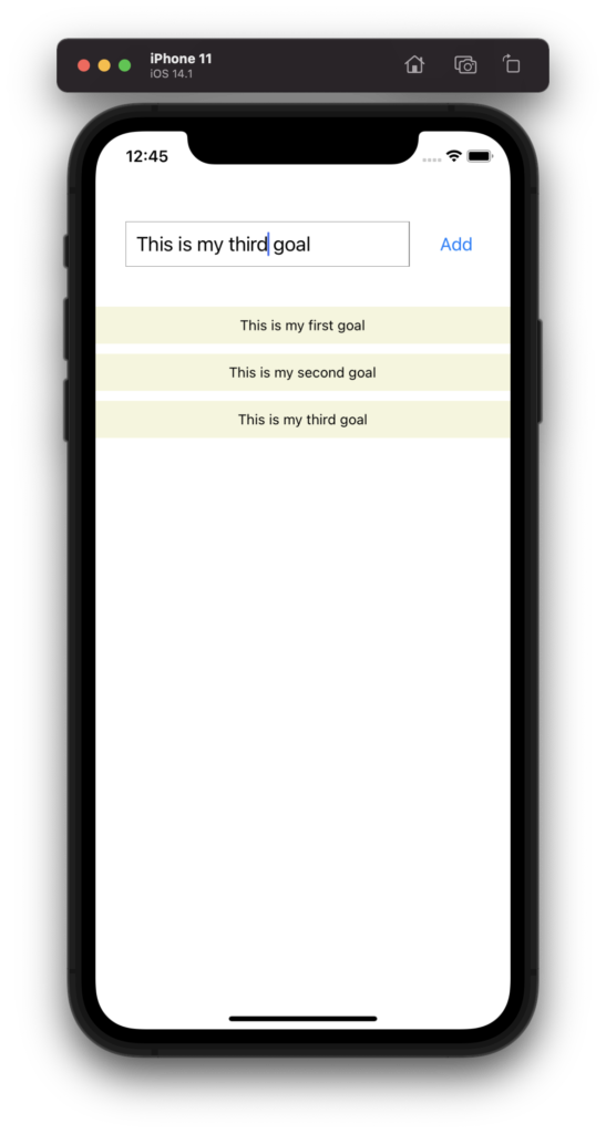
i) FlatList is a good way to display dynamic lists with many items, since you can define the number of items to be loaded. As the screen is scrolled, more items get loaded, thus enhancing the performance drastically.
Note that FlatList expects two mandatory attributes -> data & renderItem
| data | Pass the array of objects in data (goalsArray) |
| renderItem | pass a function that gets each object (goalObj) as an input argument, and then return the value of each object (goalObj.item.value) |
import React, { useState } from 'react';
import { StyleSheet, Text, View, Button, TextInput, ScrollView, FlatList } from 'react-native';

export default function App() {

  const [goalInput, setGoalInput] = useState('')
  const [goalsArray, setGoalsArray] = useState([])

  const addGoal = () => {
//FlatList does not support string array. Each item needs to be an object //with a key and value.
    const cumulativeGoals = [...goalsArray, { key: Math.random().toString(), value: goalInput }]
    setGoalsArray(cumulativeGoals)
  }

  const customStyleObj = StyleSheet.create({
    topSpace: {
      marginTop: 80
    },
    centerElementRow: {
      justifyContent: 'space-between',
      alignItems: 'center',
      flexDirection: 'row',
      margin: 20,
      padding: 10
    },
    textInput: {
      width: '80%',
      borderColor: 'grey',
      borderWidth: 0.5,
      fontSize: 20,
      padding: 10
    },
    goalsList: {
      flexDirection: 'row',
      justifyContent: 'center',
      alignItems: 'center',
      padding: 10,
      backgroundColor: '#f5f5dc',
      marginTop: 10
    }

  })

  return (
    <View>
      <View style={[customStyleObj.topSpace, customStyleObj.centerElementRow]} >
      <TextInput placeholder='Enter your idea' style={customStyleObj.textInput} onChangeText={(enteredText) => setGoalInput(enteredText)}
      value={goalInput}></TextInput>
      <Button title='Add' onPress={addGoal}></Button>
      </View>
      {
        /*
          Displat the array of goals as a vertical list
        */
      }
      <FlatList data={goalsArray} renderItem={(goalObj) => {
        return (
          <View style={customStyleObj.goalsList}>
            <Text>{goalObj.item.value}</Text>
          </View>
        )
      }} />
    </View>
  );
}
ii) Another important attribute of FlatList View is keyExtractor. If the latter is not defined, then FlatList looks for the key element in each object of the array that is passed to the data attribute. However, if you want to define any other element e.g id instead of key for each object in the data array, then define the function to extract that new identifier from each object and pass it to the keyExtractor attribute.
import React, { useState } from 'react';
import { StyleSheet, Text, View, Button, TextInput, ScrollView, FlatList } from 'react-native';

export default function App() {

  const [goalInput, setGoalInput] = useState('')
  const [goalsArray, setGoalsArray] = useState([])

  const addGoal = () => {
    const cumulativeGoals = [...goalsArray, { id: Math.random().toString(), value: goalInput }]
    setGoalsArray(cumulativeGoals)
  }

  const customStyleObj = StyleSheet.create({
    topSpace: {
      marginTop: 80
    },
    centerElementRow: {
      justifyContent: 'space-between',
      alignItems: 'center',
      flexDirection: 'row',
      margin: 20,
      padding: 10
    },
    textInput: {
      width: '80%',
      borderColor: 'grey',
      borderWidth: 0.5,
      fontSize: 20,
      padding: 10
    },
    goalsList: {
      flexDirection: 'row',
      justifyContent: 'center',
      alignItems: 'center',
      padding: 10,
      backgroundColor: '#f5f5dc',
      marginTop: 10
    }

  })

  return (
    <View>
      <View style={[customStyleObj.topSpace, customStyleObj.centerElementRow]} >
      <TextInput placeholder='Enter your idea' style={customStyleObj.textInput} onChangeText={(enteredText) => setGoalInput(enteredText)}
      value={goalInput}></TextInput>
      <Button title='Add' onPress={addGoal}></Button>
      </View>
      {
        /*
          Displat the array of goals as a vertical list
        */
      }
      <FlatList keyExtractor={(goalObj, index) => { return goalObj.id }} data={goalsArray} renderItem={(goalObj) => {
        return (
          <View style={customStyleObj.goalsList}>
            <Text>{goalObj.item.value}</Text>
          </View>
        )
      }} />
    </View>
  );
}
8. Adding Touch event to View Objects
Now, let’s try to add a touch event to our list elements, and get that item deleted from the list, when it is tapped. To make each item touchable, you need to wrap them with <Touchable> or <TouchableOpacity>
      <FlatList keyExtractor={(goalObj, index) => { return goalObj.id }} data={goalsArray} renderItem={(goalObj) => {
        return (
          <TouchableOpacity>
            <View style={customStyleObj.goalsList}>
              <Text>{goalObj.item.value}</Text>
            </View>
          </TouchableOpacity>
        )
      }} />
Next step is to add an action on touch event, so that the array items gets updated and removes the tapped item.
      <FlatList keyExtractor={(goalObj, index) => { return goalObj.id }} data={goalsArray} renderItem={(goalObj) => {
        return (
          <TouchableOpacity onPress={() => {
            setGoalsArray(goalsArray.filter((eachItem) => {
              return eachItem.id != goalObj.item.id
            }))
          }}>
            <View style={customStyleObj.goalsList}>
              <Text>{goalObj.item.value}</Text>
            </View>
          </TouchableOpacity>
        )
      }} />
9. Creating a common header for all screens
You need to define a separate header component and just reuse it in all screens just like normal react code.
a. Header.js
import React from 'react'
import { View, Text, TextInput, StyleSheet } from 'react-native'

const Header = (props) => {
    return (
        <View style={styles.header}>
            <Text style={styles.title}>{props.title}</Text>
        </View>
    )
}

const styles = StyleSheet.create({
    header: {
        width: '100%',
        height: 50,
        backgroundColor: 'grey',
        color: 'black',
        justifyContent: 'center',
        alignItems: 'center',
        marginTop: 40,
        marginBottom: 10
    },
    title: {
        fontSize: 30,
        fontWeight: 'bold'
    }
})

export default Header
b. App.js
import React from 'react'
import { View, Text, TextInput, StyleSheet } from 'react-native'
import Header from './components/Header'

const App = () => {
    return (
        <View>
            <Header title="Book a Cab"/>
            <Text>App Body</Text>
        </View>
    )
}

const styles = StyleSheet.create({

})

export default App
c. Output
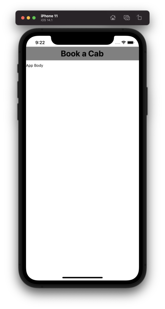
10. Creating Card like look
a. Define a Card Component
Look at how we use shadow effects to style the cards. Also note that the shadow styles only apply to iOS, however for Android, you need to use elevation.
Card.js
import React from 'react'
import { View, Text, TextInput, StyleSheet } from 'react-native'

const Card = (props) => {
    return (
        <View style={styles.cardStyle}>{props.children}</View>
    )
}

const styles = StyleSheet.create({
    cardStyle: {
            padding: 20,
            margin: 20,
            borderWidth: 0,
            shadowColor: '#470000',
            shadowOffset: { width: 0, height: 2 },
            shadowOpacity: 0.6,
            shadowRadius: 10,
            backgroundColor: 'white',
            borderRadius: 10,
            elevation: 5
    }
})

export default Card
b. Wrap contents within the Card Component
App.js
import React from 'react'
import { View, Text, TextInput, StyleSheet, Button } from 'react-native'
import Card from './components/Card'
import Header from './components/Header'

const App = () => {

    const styles = StyleSheet.create({
        buttonContainer: {
            flexDirection: 'row',
            justifyContent: 'space-around',
            alignItems: 'center',
            marginTop: 20
        },
        screen : {
            borderWidth: 0,
            borderColor: 'blue',
            width: '100%',
            marginTop: 50
        },
        textInput: {
            borderWidth: 0.5,
            borderColor: 'grey',
            margin: 10,
            padding: 20,
            fontSize: 20
        }
    })

    return (
        <View style={styles.screen}>
            <Header title="Book a Cab"/>
            <Card>
                <View>
                    <TextInput placeholder='Enter a destination' style={styles.textInput}/>
                </View>
                <View style={styles.buttonContainer}>
                    <Button title="Cancel" />
                    <Button title="Confirm" />
                </View>
            </Card>
        </View>
    )
}

export default App
c. Output
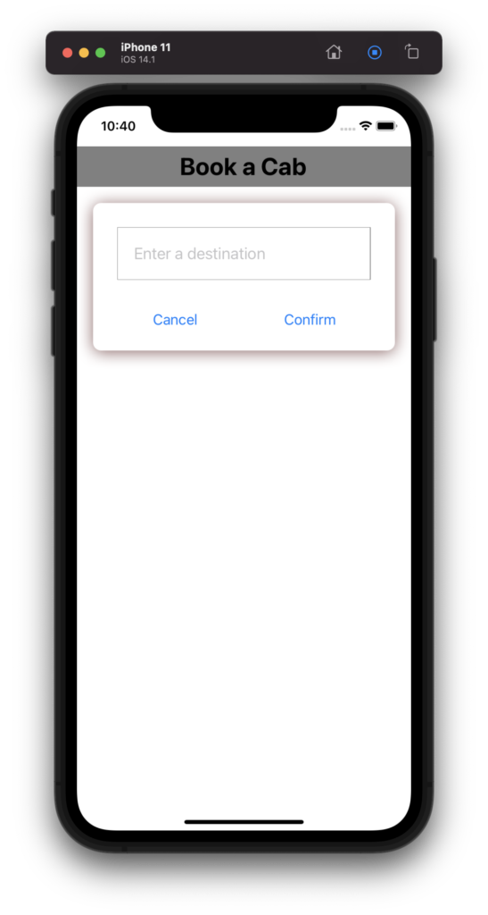
11. Styling using <View> wrapper
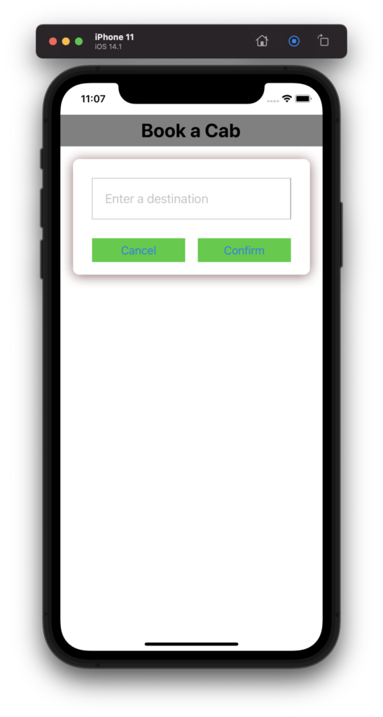
Note that you cannot style all components directly within itself. For example, you cannot style <Button> by adding style within itself, instead you need to wrap it within a <View> and add the style as part of the <View>. Look at the example below.
                <View style={styles.buttonContainer}>
                    <View style={styles.buttonStyle}>
                        <Button title="Cancel" />
                    </View>
                    <View style={styles.buttonStyle} >
                        <Button title="Confirm" />
                    </View>
                </View>
Look how the button style is defined in the <View> component rather than the <Button> itself.
    const styles = StyleSheet.create({
        buttonContainer: {
            flexDirection: 'row',
            justifyContent: 'space-around',
            alignItems: 'center',
            marginTop: 20
        },
        buttonStyle: {
            width: '44%',
            backgroundColor: '#32cd32',
            color: 'white'
        }
    })
11. Rendering Images
a. Render local images
//Using Image in App.js
<Image style={styles.logo} source={require('./assets/SoybagLogo.png')} />

//Defining the style of the image
const styles = StyleSheet.create({
  logo: {
    justifyContent: 'center',
    alignItems: 'center',
    width: 100,
    height: 100
  }
});
b. Render network images
 <Image style={styles.logo} source={{
          uri: 'https://middlewareworld.org/wp-content/uploads/2021/07/581fa2106910162c5f0ccedeb67e7d7a.jpg'
          }} />
12. Render content within the safe area of a screen
Different devices have varying screen view pattern. For example, in iPhone, there is a notch at the top of the screen that contains the camera and the speaker. You need to make sure that the views are not getting laid out there and ensure appropriate clearance from the edges. You can do this manually, however, react native provides a tag <SafeAreaView>, that can be used to ensure safe clearance from the edges. Look at the below example.
//App.js

import { StatusBar } from 'expo-status-bar';
import { StyleSheet, Text, View, Image, SafeAreaView } from 'react-native';

export default function App() {
  return (
    <SafeAreaView>
      <View style={styles.container}>
        <Image style={styles.logo} source={require('./assets/SoybagLogo.png')} />
        <Text>Open up App.js to start working on your app!</Text>
        <StatusBar style="auto" />
      </View>
    </SafeAreaView>
  );
}

const styles = StyleSheet.create({
  container: {
    backgroundColor: '#fff',
    alignItems: 'center',
    justifyContent: 'center',
  },
  logo: {
    justifyContent: 'center',
    alignItems: 'center',
    width: 100,
    height: 100
  }
});
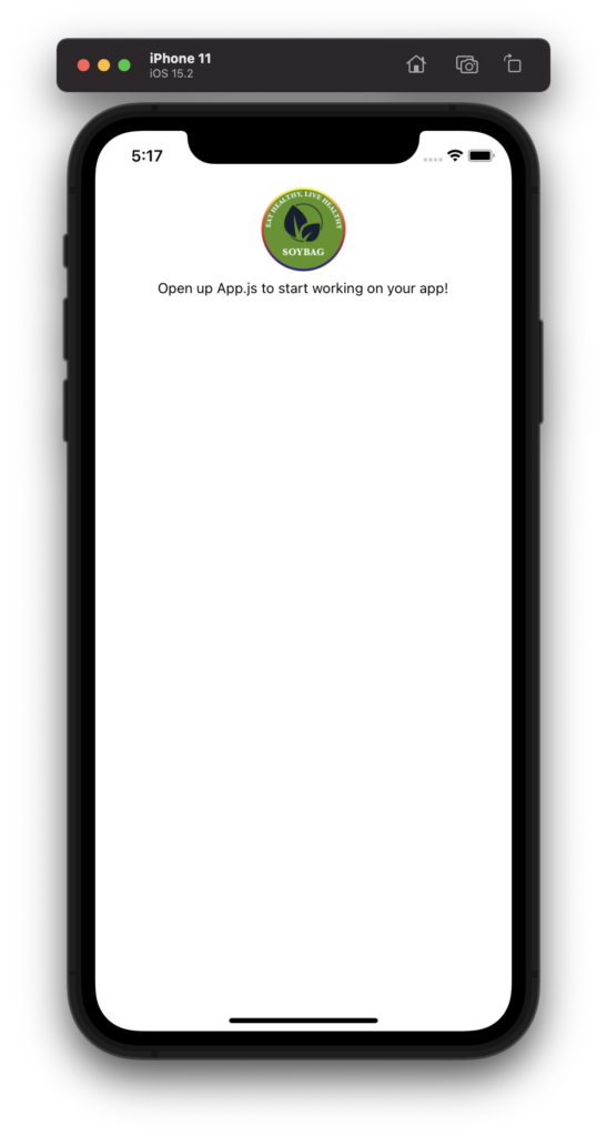
See how the logo gets laid out with a proper clearance from the top.
13. Handling Keyboard types and dismiss when needed
You might need to display different type of keyboards for different <InputText>. In addition, the keyboard needs to be dismissed when you click anywhere outside the text box. React provides few built in capabilities to enable such features easily.
<TextInput keyboardType='number-pad' placeholder="Phone" />
Note that there are many inbuilt options provided by react native other than number-pad. You can choose what fits your purpose.
To dismiss the keyboard, especially in iOS, which doesn’t have a back button, you need to wrap the entire code with <TouchableWithoutFeedback>, and implement its onPress function.
<TouchableWithoutFeedback onPress={Keyboard.dismiss}>
The Keyboard is again an import from react-native.
import { Keyboard } from 'react-native'