Get Started with Bootstrap
Bootstrap is an excellent CSS and JavaScript framework for building responsive websites. It has built in CSS classes that helps to design and place HTML elements nicely on the page. Let’s look at the essential features to start with Bootstrap.
Starter Template
Use below HTML code as a starter template to incorporate Bootstrap. Refer this link for more details.
<!doctype html>
<html lang="en">
  <head>
    <!-- Required meta tags -->
    <meta charset="utf-8">
    <meta name="viewport" content="width=device-width, initial-scale=1">

    <!-- Bootstrap CSS -->
    <link href="https://cdn.jsdelivr.net/npm/bootstrap@5.0.1/dist/css/bootstrap.min.css" rel="stylesheet" integrity="sha384-+0n0xVW2eSR5OomGNYDnhzAbDsOXxcvSN1TPprVMTNDbiYZCxYbOOl7+AMvyTG2x" crossorigin="anonymous">

    <title>Hello, world!</title>
  </head>
  <body>
    <h1>Hello, world!</h1>

    <!-- Optional JavaScript; choose one of the two! -->

    <!-- Option 1: Bootstrap Bundle with Popper -->
    <script src="https://cdn.jsdelivr.net/npm/bootstrap@5.0.1/dist/js/bootstrap.bundle.min.js" integrity="sha384-gtEjrD/SeCtmISkJkNUaaKMoLD0//ElJ19smozuHV6z3Iehds+3Ulb9Bn9Plx0x4" crossorigin="anonymous"></script>

    <!-- Option 2: Separate Popper and Bootstrap JS -->
    <!--
    <script src="https://cdn.jsdelivr.net/npm/@popperjs/core@2.9.2/dist/umd/popper.min.js" integrity="sha384-IQsoLXl5PILFhosVNubq5LC7Qb9DXgDA9i+tQ8Zj3iwWAwPtgFTxbJ8NT4GN1R8p" crossorigin="anonymous"></script>
    <script src="https://cdn.jsdelivr.net/npm/bootstrap@5.0.1/dist/js/bootstrap.min.js" integrity="sha384-Atwg2Pkwv9vp0ygtn1JAojH0nYbwNJLPhwyoVbhoPwBhjQPR5VtM2+xf0Uwh9KtT" crossorigin="anonymous"></script>
    -->
  </body>
</html>
Text & Background Colors
<div class="text-white bg-dark">Bootstrap Heading</div>
Text Colors – text-info, text-primary, text-secondary, text-success, text-warning, text-dark, text-danger, text-light
Background Colors – bg-info, bg-primary, bg-secondary, bg-success, bg-warning, bg-dark, bg-danger, bg-light
Below are the shades of all those color schemes.

Text Alignment
text-start > Left Alignment with respect to the container block
text-center > Center Alignment with respect to the container block
text-end > Right Alignment with respect to the container block
    <div class="text-white bg-dark text-start">Bootstrap Heading</div>
    <div class="text-white bg-success text-center">Bootstrap Heading</div>
    <div class="text-white bg-dark text-end">Bootstrap Heading</div>
Layouts
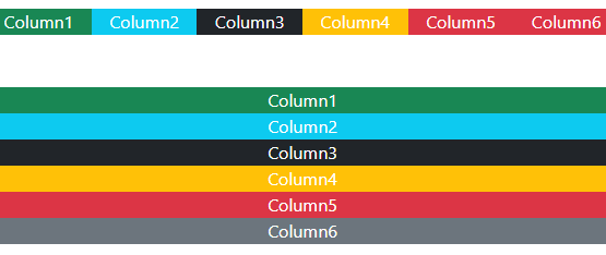
Bootstrap divides the screen width into 12 equal columns. Below is a typical way of arranging items column wise.
    <div class="row text-white">
        <div class="col text-center bg-success">Column1</div>
        <div class="col text-center bg-info">Column2</div>
        <div class="col text-center bg-dark">Column3</div>
        <div class="col text-center bg-warning">Column4</div>
        <div class="col text-center bg-danger">Column5</div>
        <div class="col text-center bg-danger">Column6</div>
    </div>
    <br><br>
    <div class="row text-white">
        <div class="col-sm-2 text-center bg-success">Column1</div>
        <div class="col-sm-2 text-center bg-info">Column2</div>
        <div class="col-sm-2 text-center bg-dark">Column3</div>
        <div class="col-sm-2 text-center bg-warning">Column4</div>
        <div class="col-sm-2 text-center bg-danger">Column5</div>
        <div class="col-sm-2 text-center bg-secondary">Column6</div>
    </div>
row > Any such Layouts should be surrounded by a “row” class, as parent.
col > This distributes all child <div> equally along the available space.
col-sm-2 > The element takes 2 column width, and it breaks vertically with lower screen width. sm stands for small, lg stands for large and md stands for medium. sm, lg, md denotes the breakpoint to arrange the inline items vertically. Below is how it looks like with lower screen width.
col-md-3 > Element takes column width of 3, and breakpoint is at medium length of the element.
Look how second row breaks automatically at lower screen widths, whereas the first row doesn’t. Note that we specify col for the first row, but col-sm-2 for the second one. Hence, there is a breakpoint for second row, but not for the first one.
Note: If more than 12 columns are placed within a single row, each group of extra columns will, as one unit, wrap onto a new line.
Containers
Use container-fluid or container class to occupy the full width or have some left and right margins respectively.
    <div class="container bg-primary text-white">
        Lorem Ipsum is simply dummy text of the printing and typesetting industry. Lorem Ipsum has been the industry's standard dummy text ever since the 1500s, when an unknown printer took a galley of type and scrambled it to make a type specimen book. It has survived not only five centuries, but also the leap into electronic typesetting, remaining essentially unchanged. It was popularised in the 1960s with the release of Letraset sheets containing Lorem Ipsum passages, and more recently with desktop publishing software like Aldus PageMaker including versions of Lorem Ipsum.
Why do we use it? It is a long established fact that a reader will be distracted by the readable content of a page when looking at its layout. The point of using Lorem Ipsum is that it has a more-or-less normal distribution of letters, as opposed to using 'Content here, content here', making it look like readable English. Many desktop publishing packages and web page editors now use Lorem Ipsum as their default model text, and a search for 'lorem ipsum' will uncover many web sites still in their infancy. Various versions have evolved over the years, sometimes by accident, sometimes on purpose (injected humour and the like).
    </div>

    <br><br>

    <div class="container-fluid bg-primary text-white">
        Lorem Ipsum is simply dummy text of the printing and typesetting industry. Lorem Ipsum has been the industry's standard dummy text ever since the 1500s, when an unknown printer took a galley of type and scrambled it to make a type specimen book. It has survived not only five centuries, but also the leap into electronic typesetting, remaining essentially unchanged. It was popularised in the 1960s with the release of Letraset sheets containing Lorem Ipsum passages, and more recently with desktop publishing software like Aldus PageMaker including versions of Lorem Ipsum.
Why do we use it? It is a long established fact that a reader will be distracted by the readable content of a page when looking at its layout. The point of using Lorem Ipsum is that it has a more-or-less normal distribution of letters, as opposed to using 'Content here, content here', making it look like readable English. Many desktop publishing packages and web page editors now use Lorem Ipsum as their default model text, and a search for 'lorem ipsum' will uncover many web sites still in their infancy. Various versions have evolved over the years, sometimes by accident, sometimes on purpose (injected humour and the like).
    </div>
Note : The container class automatically changes to container-fluid when screen width reduces.
Offset in Layout
Use classes e.g. offset-md-3, offset-2, offset-lg-4 etc. to offset the start of elements.
      <div class="container">
        <div class="row">
          <div class="col-md-4">.col-md-4</div>
          <div class="col-md-4 offset-md-4">.col-md-4 .offset-md-4</div>
        </div>
        <div class="row">
          <div class="col-md-3 offset-md-3">.col-md-3 .offset-md-3</div>
          <div class="col-md-3 offset-md-3">.col-md-3 .offset-md-3</div>
        </div>
        <div class="row">
          <div class="col-md-6 offset-md-3">.col-md-6 .offset-md-3</div>
        </div>
      </div>

Margin Start/ Margin End/Margin Auto
Control the margin start using ms-1, ms-2, ms-3 etc. and end using me-1, me-2, me-3 etc.
      <div class="container">
        <div class="row">
          <div class="col-md-4 bg-primary text-white ms-1 me-5">.col-md-4</div>
          <div class="col-md-4 bg-dark text-white ms-2">.col-md-4 .offset-md-4</div>
        </div>
        <div class="row">
          <div class="col-md-3 bg-secondary text-white ms-3">.col-md-3 .offset-md-3</div>
          <div class="col-md-3 bg-danger text-white ms-3">.col-md-3 .offset-md-3</div>
        </div>
        <div class="row">
          <div class="col-md-6 bg-warning text-white ms-4">.col-md-6 .offset-md-3</div>
        </div>
      </div>
Floats
Use float-md-end, float-lg-start, float-sm-end or the like to float elements to right or left.
        <img src="./rainbow.png" class="col-md-1 float-md-end mb-3 ms-md-3" alt="...">
        <p>
          A paragraph of placeholder text. We're using it here to show the use of the clearfix class. We're adding quite a few meaningless phrases here to demonstrate how the columns interact here with the floated image.
        </p>
        <p>
          As you can see the paragraphs gracefully wrap around the floated image. Now imagine how this would look with some actual content in here, rather than just this boring placeholder text that goes on and on, but actually conveys no tangible information at. It simply takes up space and should not really be read.
        </p>
        <p>
          And yet, here you are, still persevering in reading this placeholder text, hoping for some more insights, or some hidden easter egg of content. A joke, perhaps. Unfortunately, there's none of that here.
        </p>
Clearfix
To nullify the float effect, use the clearfix class.
        <img src="./rainbow.png" class="col-md-1 float-md-start mb-3 ms-md-3" alt="...">
        <p class="clearfix">
          A paragraph of placeholder text. We're using it here to show the use of the clearfix class. We're adding quite a few meaningless phrases here to demonstrate how the columns interact here with the floated image.
        </p>
        <p>
          As you can see the paragraphs gracefully wrap around the floated image. Now imagine how this would look with some actual content in here, rather than just this boring placeholder text that goes on and on, but actually conveys no tangible information at. It simply takes up space and should not really be read.
        </p>
        <p>
          And yet, here you are, still persevering in reading this placeholder text, hoping for some more insights, or some hidden easter egg of content. A joke, perhaps. Unfortunately, there's none of that here.
        </p>
Gutters
Gutters are margins in X-direction, Y-direction or in both.
gx-<number> – Horizontal Gutter
gy-<number> – Vertical Gutter
g-<number> – Both Vertical & Horizontal
g-0 – No Gutter
No Gutter
        <div class="container">
            <div class="row g-0">
              <div class="col-6">
                <div class="p-3 bg-danger">Column11</div>
              </div>
              <div class="col-6">
                <div class="p-3 bg-dark">Column22</div>
              </div>
              <div class="col-6">
                <div class="p-3 bg-warning">Column33</div>
              </div>
              <div class="col-6">
                <div class="p-3 bg-primary">Column44</div>
              </div>
            </div>
        </div>
Horizontal Gutter
        <div class="container">
            <div class="row gx-4">
              <div class="col-6">
                <div class="p-3 bg-danger">Column11</div>
              </div>
              <div class="col-6">
                <div class="p-3 bg-dark">Column22</div>
              </div>
              <div class="col-6">
                <div class="p-3 bg-warning">Column33</div>
              </div>
              <div class="col-6">
                <div class="p-3 bg-primary">Column44</div>
              </div>
            </div>
        </div>
Vertical Gutter
        <div class="container">
            <div class="row gy-4 gx-0">
              <div class="col-6">
                <div class="p-3 bg-danger">Column11</div>
              </div>
              <div class="col-6">
                <div class="p-3 bg-dark">Column22</div>
              </div>
              <div class="col-6">
                <div class="p-3 bg-warning">Column33</div>
              </div>
              <div class="col-6">
                <div class="p-3 bg-primary">Column44</div>
              </div>
            </div>
        </div>
Horizontal & Vertical Gutter
        <div class="container">
            <div class="row g-4">
              <div class="col-6">
                <div class="p-3 bg-danger">Column11</div>
              </div>
              <div class="col-6">
                <div class="p-3 bg-dark">Column22</div>
              </div>
              <div class="col-6">
                <div class="p-3 bg-warning">Column33</div>
              </div>
              <div class="col-6">
                <div class="p-3 bg-primary">Column44</div>
              </div>
            </div>
        </div>
Column Order
In a row/col grid, use order-<number> to reset the display order.
            <div class="row">
                <div class="col-md-4 bg-primary text-white order-2">Column11</div>
                <div class="col-md-4 bg-dark text-white order-1">Column22</div>
              </div>
Visible/Invisible
Use visible or invisible classes to update the visibility of the element. Note that this will not remove the element from DOM, but just makes it invisible, still taking up space.
            <div class="row">
            <div class="row border border-2 border-dark">
                <div class="col-md-4 bg-primary text-white invisible">Column11</div>
                <div class="col-md-4 bg-dark text-white">Column22</div>
            </div>
Border
Specify border thickness and color using below classes. Note that you need to use a set of classes, and the first one MUST be border.
        <div>
            <div class="border border-2 border-dark text-center my-2">
                <img src="./rainbow.png" height="200px" alt="">
            </div>
            <div class="border border-5 border-primary text-center my-2">
                <img src="./rainbow.png" height="200px" alt="">
            </div>
            <div class="border border-3 border-secondary text-center my-2">
                <img src="./rainbow.png" height="200px" alt="">
            </div>
        </div>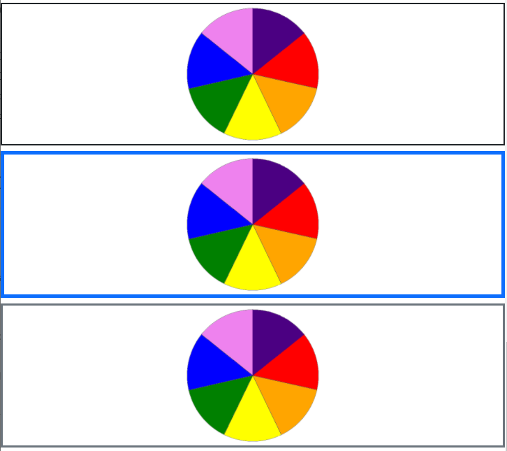
Padding/Margin
No Padding/No Margin
        <div>
            <div class="border border-dark">Home</div>
            <div class="border border-dark">Blog</div>
            <div class="border border-dark">Contact</div>
            <div class="border border-dark">About</div>
        </div>
Vertical Padding & Margin
        <div>
            <div class="border border-dark my-5 py-2">Home</div>
            <div class="border border-dark my-5 py-2">Blog</div>
            <div class="border border-dark my-5 py-2">Contact</div>
            <div class="border border-dark my-5 py-2">About</div>
        </div>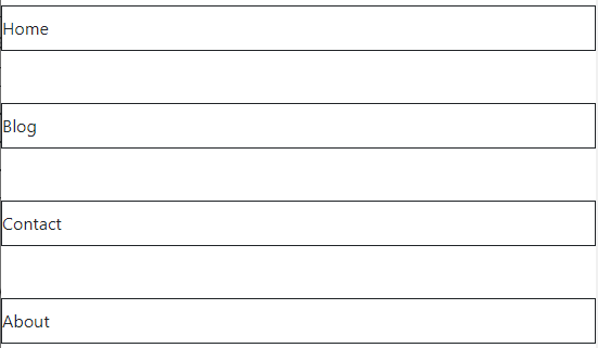
Horizontal Padding & Margin
        <div class="border border-primary border-2">
            <div class="border border-dark mx-5 px-2">Home</div>
            <div class="border border-dark mx-5 px-2">Blog</div>
            <div class="border border-dark mx-5 px-2">Contact</div>
            <div class="border border-dark mx-5 px-2">About</div>
        </div>
Horizontal & Vertical Padding/Margin
        <div class="border border-primary border-2">
            <div class="border border-dark m-5 p-2">Home</div>
            <div class="border border-dark m-5 p-2">Blog</div>
            <div class="border border-dark m-5 p-2">Contact</div>
            <div class="border border-dark m-5 p-2">About</div>
        </div>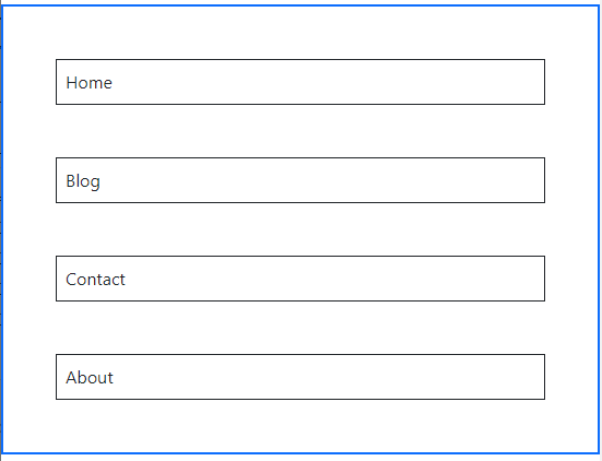
Text styles & Decoration
        <p class="h1">This is the heading</p>
        <p class="display-1">This is the custom display</p>
        <p class="lead">This is the lead line</p>
        <p class="mark">This line is highlighted</p>
        <p class="text-decoration-line-through">This line is crossed</p>
        <p class="text-decoration-underline">This line is underlines</p>
        <p class="small">This line is small</p>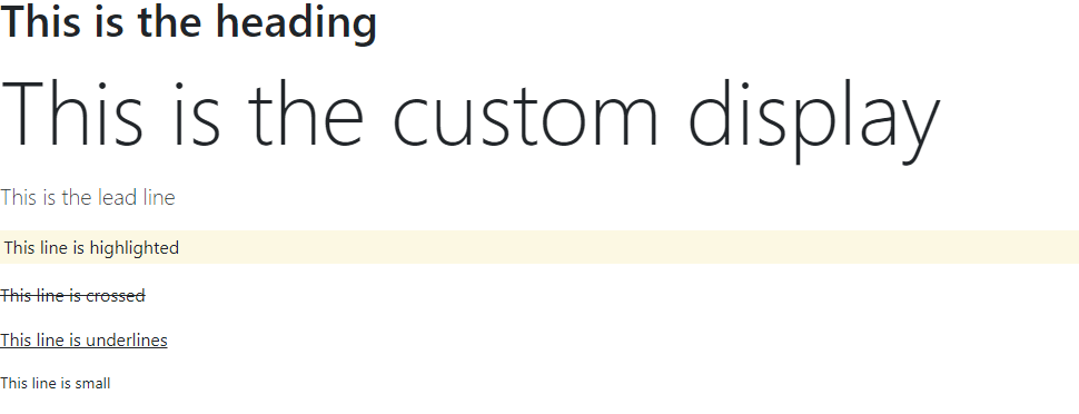
Use blockquote and blockquote-footer to style well known quotes.
        <figure class="text-center">
            <blockquote class="blockquote">
              <p>A well-known quote, contained in a blockquote element.</p>
            </blockquote>
            <figcaption class="blockquote-footer">
              Someone famous in <cite title="Source Title">Source Title</cite>
            </figcaption>
        </figure>
Styled & Unstyled Lists
<ul class="list-unstyled">
  <li>This is a list.</li>
  <li>It appears completely unstyled.</li>
  <li>Structurally, it's still a list.</li>
  <li>However, this style only applies to immediate child elements.</li>
  <li>Nested lists:
    <ul>
      <li>are unaffected by this style</li>
      <li>will still show a bullet</li>
      <li>and have appropriate left margin</li>
    </ul>
  </li>
  <li>This may still come in handy in some situations.</li>
</ul>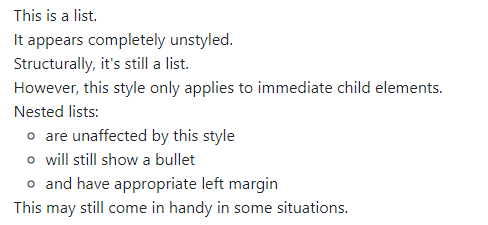
Font Size/ Font Weight/ Font Style
        <div class="text-center">
            <p class="fs-1">Font Size 1</p>
            <p class="fs-2">Font Size 2</p>
            <p class="fs-3">Font Size 3</p>
            <p class="fs-4">Font Size 4</p>
            <p class="fs-5">Font Size 5</p>
            <p class="fw-bold">Bold text.</p>
            <p class="fw-bolder">Bolder weight text (relative to the parent element).</p>
            <p class="fw-normal">Normal weight text.</p>
            <p class="fw-light">Light weight text.</p>
            <p class="fw-lighter">Lighter weight text (relative to the parent element).</p>
            <p class="fst-italic">Italic text.</p>
            <p class="fst-normal">Text with normal font style</p>
        </div>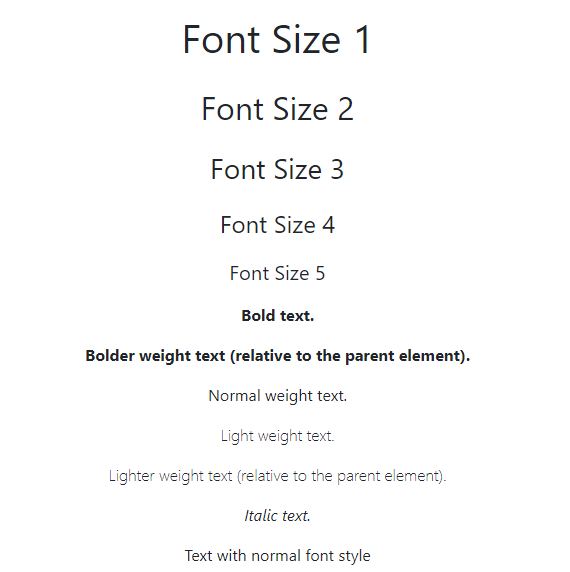
Updating the CSS Display
Use d-<css_display_value> e.g. d-inline-block, d-block, d-none etc. to change the display attribute.
        <ul class="list-unstyled">
            <li class="d-inline-block m-2 p-2 bg-dark text-white rounded-2">Home</li>
            <li class="d-inline-block m-2 p-2 bg-dark text-white rounded-2">Blog</li>
            <li class="d-inline-block m-2 p-2 bg-dark text-white rounded-2">About</li>
            <li class="d-inline-block m-2 p-2 bg-dark text-white rounded-2">Contact</li>
        </ul>
Rounded Corners
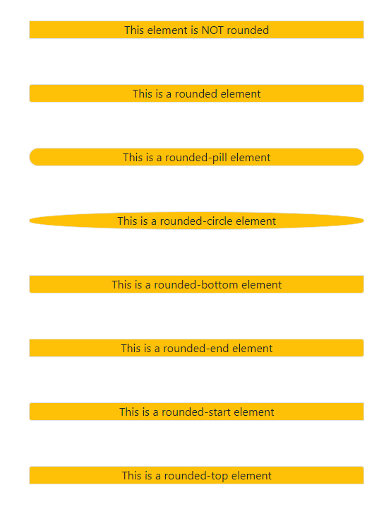
Use the rounded-<number> class to create nice rounded corners. There are several other rounded attributes. Look at all possible combinations here.
        <p class="bg-warning text-dark border w-25 mx-auto text-center">This element is NOT rounded</p>
        <br><br>
        <p class="bg-warning text-dark border rounded w-25 mx-auto text-center">This is a rounded element</p>
        <br><br>
        <p class="bg-warning text-dark border rounded-pill w-25 mx-auto text-center">This is a rounded-pill element</p>
        <br><br>
        <p class="bg-warning text-dark border rounded-circle w-25 mx-auto text-center">This is a rounded-circle element</p>
        <br><br>
        <p class="bg-warning text-dark border rounded-bottom w-25 mx-auto text-center">This is a rounded-bottom element</p>
        <br><br>
        <p class="bg-warning text-dark border rounded-end w-25 mx-auto text-center">This is a rounded-end element</p>
        <br><br>
        <p class="bg-warning text-dark border rounded-start w-25 mx-auto text-center">This is a rounded-start element</p>
        <br><br>
        <p class="bg-warning text-dark border rounded-top w-25 mx-auto text-center">This is a rounded-top element</p>
Responsive Images
Use img-fluid class to make the images response to screen width. Look how the first image adjusts with lower screen width, whereas the second one just overflows without any adjustment.
        <img class="img-fluid" src="./scenary.jpg" alt="">
        <img class="" src="./scenary.jpg" alt="">

Center Elements
Use text-center to horizontally center the text in the available space. Note that this class has to be associated with the containing element. However, to center a col or col-<breakpoint>-<number> element at the center of the screen horizontally, you need to use mx-auto to position that at the center.
        <div class="row">
            <div class="col-4 border text-center mx-auto">
                This is a column of width col-4
            </div>
        </div>

        <div class="row">
            <div class="col-4 border text-center mx-auto">
                This is a column of width col-4
            </div>
        </div>
Note: text-center will only align the element within the container element, whereas mx-auto adjusts an element itself at the center.
Table Styling
Use table as the first class, followed by table-<color> e.g. table-secondary, table-info etc to style tables. Below are the other styling classes.
table-striped > Creates striped colors
table-hover > Creates hovering effect on the table rows
table-active > Highlights a row or one particular cell, depending on whether it is mentioned with tr or td
table-bordered/table-borderless > Whether each cell will be bordered. By default, there is only horizontal borders. This class introduces vertical borders as well, thus creating borders around each cell.
border-primary > Color of the border.
table-sm > Small table that removes the extra padding in each cell.
         <table class="table table-secondary table-striped table-hover table-bordered border-dark">
            <thead class="table table-dark text-white table-bordered border-light">
                <td>Index</td>
                <td>Name</td>
                <td>Profession</td>
                <td>Place</td>
            </thead>
            <tr>
                <th>1</th>
                <td>Animesh Banerjee</td>
                <td>Information Technology</td>
                <td>Singapore</td>
            </tr>
            <tr class="table-active">
                <td>2</td>
                <td>Moumita Banerjee</td>
                <td>Scientist</td>
                <td>United Kingdom</td>
            </tr>
            <tr>
                <td>3</td>
                <td>Aishani Banerjee</td>
                <td>Student</td>
                <td class="table-active">United States</td>
            </tr>
            <tr>
                <td>4</td>
                <td>Sudipto Banerjee</td>
                <td>Student</td>
                <td>India</td>
            </tr>
        </table>
Image with Caption
Use below HTML tags and classes to create caption, along with the image.
    <div class="text-center">
    <figure class="figure">
        <img src="./rainbow.png" class="figure-img img-fluid rounded" alt="...">
        <figcaption class="figure-caption text-end">A rainbow wheel</figcaption>
      </figure>
    </div>
Forms
Forms are an integral part of any website. Use below code for a simple form.
<form>
  <div class="mb-3">
    <label for="exampleInputEmail1" class="form-label">Email address</label>
    <input type="email" class="form-control" id="exampleInputEmail1" aria-describedby="emailHelp">
    <div id="emailHelp" class="form-text">We'll never share your email with anyone else.</div>
  </div>
  <div class="mb-3">
    <label for="exampleInputPassword1" class="form-label">Password</label>
    <input type="password" class="form-control" id="exampleInputPassword1">
  </div>
  <div class="mb-3 form-check">
    <input type="checkbox" class="form-check-input" id="exampleCheck1">
    <label class="form-check-label" for="exampleCheck1">Check me out</label>
  </div>
  <button type="submit" class="btn btn-primary">Submit</button>
</form>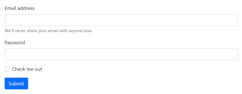
Forms has a lot of other aspects and styling. Check the bootstrap documentation for all other options.
Carousel
Use below code for carousel with indicators and controls
<div id="carouselExampleIndicators" class="carousel slide" data-bs-ride="carousel">
  <div class="carousel-indicators">
    <button type="button" data-bs-target="#carouselExampleIndicators" data-bs-slide-to="0" class="active" aria-current="true" aria-label="Slide 1"></button>
    <button type="button" data-bs-target="#carouselExampleIndicators" data-bs-slide-to="1" aria-label="Slide 2"></button>
    <button type="button" data-bs-target="#carouselExampleIndicators" data-bs-slide-to="2" aria-label="Slide 3"></button>
  </div>
  <div class="carousel-inner">
    <div class="carousel-item active">
      <img src="..." class="d-block w-100" alt="...">
    </div>
    <div class="carousel-item">
      <img src="..." class="d-block w-100" alt="...">
    </div>
    <div class="carousel-item">
      <img src="..." class="d-block w-100" alt="...">
    </div>
  </div>
  <button class="carousel-control-prev" type="button" data-bs-target="#carouselExampleIndicators" data-bs-slide="prev">
    <span class="carousel-control-prev-icon" aria-hidden="true"></span>
    <span class="visually-hidden">Previous</span>
  </button>
  <button class="carousel-control-next" type="button" data-bs-target="#carouselExampleIndicators" data-bs-slide="next">
    <span class="carousel-control-next-icon" aria-hidden="true"></span>
    <span class="visually-hidden">Next</span>
  </button>
</div>
Check out bootstrap documentation for more details.
Note: You need to include the below JavaScript files in the HTML for the controls to work
      <script src="https://cdn.jsdelivr.net/npm/@popperjs/core@2.9.2/dist/umd/popper.min.js" integrity="sha384-IQsoLXl5PILFhosVNubq5LC7Qb9DXgDA9i+tQ8Zj3iwWAwPtgFTxbJ8NT4GN1R8p" crossorigin="anonymous"></script>
      <script src="https://cdn.jsdelivr.net/npm/bootstrap@5.0.1/dist/js/bootstrap.min.js" integrity="sha384-Atwg2Pkwv9vp0ygtn1JAojH0nYbwNJLPhwyoVbhoPwBhjQPR5VtM2+xf0Uwh9KtT" crossorigin="anonymous"></script>
Accordion
    <div class="accordion" id="accordionPanelsStayOpenExample">
        <div class="accordion-item">
          <h2 class="accordion-header" id="panelsStayOpen-headingOne">
            <button class="accordion-button" type="button" data-bs-toggle="collapse" data-bs-target="#panelsStayOpen-collapseOne" aria-expanded="true" aria-controls="panelsStayOpen-collapseOne">
              Accordion Item #1
            </button>
          </h2>
          <div id="panelsStayOpen-collapseOne" class="accordion-collapse collapse show" aria-labelledby="panelsStayOpen-headingOne">
            <div class="accordion-body">
              <strong>This is the first item's accordion body.</strong> It is shown by default, until the collapse plugin adds the appropriate classes that we use to style each element. These classes control the overall appearance, as well as the showing and hiding via CSS transitions. You can modify any of this with custom CSS or overriding our default variables. It's also worth noting that just about any HTML can go within the <code>.accordion-body</code>, though the transition does limit overflow.
            </div>
          </div>
        </div>
        <div class="accordion-item">
          <h2 class="accordion-header" id="panelsStayOpen-headingTwo">
            <button class="accordion-button collapsed" type="button" data-bs-toggle="collapse" data-bs-target="#panelsStayOpen-collapseTwo" aria-expanded="false" aria-controls="panelsStayOpen-collapseTwo">
              Accordion Item #2
            </button>
          </h2>
          <div id="panelsStayOpen-collapseTwo" class="accordion-collapse collapse" aria-labelledby="panelsStayOpen-headingTwo">
            <div class="accordion-body">
              <strong>This is the second item's accordion body.</strong> It is hidden by default, until the collapse plugin adds the appropriate classes that we use to style each element. These classes control the overall appearance, as well as the showing and hiding via CSS transitions. You can modify any of this with custom CSS or overriding our default variables. It's also worth noting that just about any HTML can go within the <code>.accordion-body</code>, though the transition does limit overflow.
            </div>
          </div>
        </div>
        <div class="accordion-item">
          <h2 class="accordion-header" id="panelsStayOpen-headingThree">
            <button class="accordion-button collapsed" type="button" data-bs-toggle="collapse" data-bs-target="#panelsStayOpen-collapseThree" aria-expanded="false" aria-controls="panelsStayOpen-collapseThree">
              Accordion Item #3
            </button>
          </h2>
          <div id="panelsStayOpen-collapseThree" class="accordion-collapse collapse" aria-labelledby="panelsStayOpen-headingThree">
            <div class="accordion-body">
              <strong>This is the third item's accordion body.</strong> It is hidden by default, until the collapse plugin adds the appropriate classes that we use to style each element. These classes control the overall appearance, as well as the showing and hiding via CSS transitions. You can modify any of this with custom CSS or overriding our default variables. It's also worth noting that just about any HTML can go within the <code>.accordion-body</code>, though the transition does limit overflow.
            </div>
          </div>
        </div>
      </div>
Note: You need to include the below JavaScript files in the HTML for the controls to work
      <script src="https://cdn.jsdelivr.net/npm/@popperjs/core@2.9.2/dist/umd/popper.min.js" integrity="sha384-IQsoLXl5PILFhosVNubq5LC7Qb9DXgDA9i+tQ8Zj3iwWAwPtgFTxbJ8NT4GN1R8p" crossorigin="anonymous"></script>
      <script src="https://cdn.jsdelivr.net/npm/bootstrap@5.0.1/dist/js/bootstrap.min.js" integrity="sha384-Atwg2Pkwv9vp0ygtn1JAojH0nYbwNJLPhwyoVbhoPwBhjQPR5VtM2+xf0Uwh9KtT" crossorigin="anonymous"></script>
Find more information on accordion here.
Buttons
<button type="button" class="btn btn-primary">Primary</button>
<button type="button" class="btn btn-secondary">Secondary</button>
<button type="button" class="btn btn-success">Success</button>
<button type="button" class="btn btn-danger">Danger</button>
<button type="button" class="btn btn-warning">Warning</button>
<button type="button" class="btn btn-info">Info</button>
<button type="button" class="btn btn-light">Light</button>
<button type="button" class="btn btn-dark">Dark</button>
<button type="button" class="btn btn-link">Link</button>
<button type="button" class="btn btn-outline-primary">Primary</button>
<button type="button" class="btn btn-outline-secondary">Secondary</button>
<button type="button" class="btn btn-outline-success">Success</button>
<button type="button" class="btn btn-outline-danger">Danger</button>
<button type="button" class="btn btn-outline-warning">Warning</button>
<button type="button" class="btn btn-outline-info">Info</button>
<button type="button" class="btn btn-outline-light">Light</button>
<button type="button" class="btn btn-outline-dark">Dark</button>
Buttons with Dropdown
      <div class="btn-group">
        <button type="button" class="btn btn-danger dropdown-toggle" data-bs-toggle="dropdown" aria-expanded="false">
          Action
        </button>
        <ul class="dropdown-menu">
          <li><a class="dropdown-item" href="#">Action</a></li>
          <li><a class="dropdown-item" href="#">Another action</a></li>
          <li><a class="dropdown-item" href="#">Something else here</a></li>
          <li><hr class="dropdown-divider"></li>
          <li><a class="dropdown-item" href="#">Separated link</a></li>
        </ul>
      </div>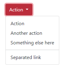
Split Buttons with Dropdown
    <div class="text-center">
        <div class="btn-group">
            <button type="button" class="btn btn-danger">Action</button>
            <button type="button" class="btn btn-danger dropdown-toggle dropdown-toggle-split" data-bs-toggle="dropdown" aria-expanded="false">
            <span class="visually-hidden">Toggle Dropdown</span>
            </button>
            <ul class="dropdown-menu">
            <li><a class="dropdown-item" href="#">Action</a></li>
            <li><a class="dropdown-item" href="#">Another action</a></li>
            <li><a class="dropdown-item" href="#">Something else here</a></li>
            <li><hr class="dropdown-divider"></li>
            <li><a class="dropdown-item" href="#">Separated link</a></li>
            </ul>
        </div>
    </div>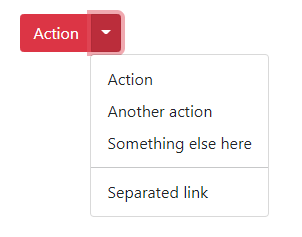
Button Size
        <button class="btn btn-secondary btn-lg mx-2">Large Button</button>
        <button class="btn btn-secondary btn-md">Medium Button</button>
        <button class="btn btn-secondary btn-sm">Small Button</button>
Dropdown Right
<div class="btn-group dropend">
    <button type="button" class="btn btn-secondary dropdown-toggle" data-bs-toggle="dropdown" aria-expanded="false">
      Dropright
    </button>
    <ul class="dropdown-menu">
        <li><a class="dropdown-item" href="#">Action</a></li>
        <li><a class="dropdown-item" href="#">Another action</a></li>
        <li><a class="dropdown-item" href="#">Something else here</a></li>
    </ul>
  </div>

  <!-- Split dropend button -->
  <div class="btn-group dropend">
    <button type="button" class="btn btn-secondary">
      Split dropend
    </button>
    <button type="button" class="btn btn-secondary dropdown-toggle dropdown-toggle-split" data-bs-toggle="dropdown" aria-expanded="false">
      <span class="visually-hidden">Toggle Dropright</span>
    </button>
    <ul class="dropdown-menu">
      <!-- Dropdown menu links -->
    </ul>
  </div>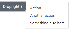
Dropdown Left
<div class="btn-group dropstart">
    <button type="button" class="btn btn-secondary dropdown-toggle" data-bs-toggle="dropdown" aria-expanded="false">
      Dropleft
    </button>
    <ul class="dropdown-menu">
        <li><a class="dropdown-item" href="#">Action</a></li>
        <li><a class="dropdown-item" href="#">Another action</a></li>
        <li><a class="dropdown-item" href="#">Something else here</a></li>
    </ul>
  </div>

  <!-- Split dropend button -->
  <div class="btn-group dropdown">
    <button type="button" class="btn btn-secondary">
      Split dropend
    </button>
    <button type="button" class="btn btn-secondary dropdown-toggle dropdown-toggle-split" data-bs-toggle="dropdown" aria-expanded="false">
      <span class="visually-hidden">Toggle Dropright</span>
    </button>
    <ul class="dropdown-menu">
      <!-- Dropdown menu links -->
    </ul>
  </div>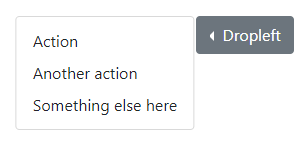
Note: The classes dropdown, dropup, dropend, dropstart governs the direction in which it opens.
Components
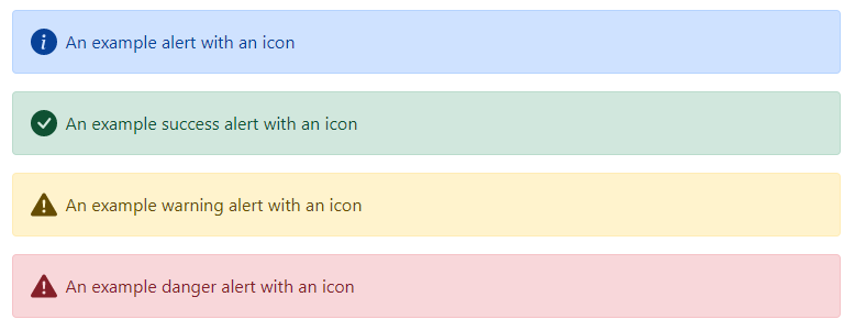
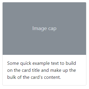
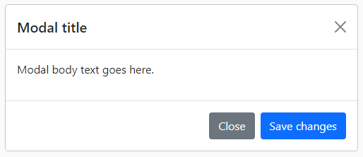
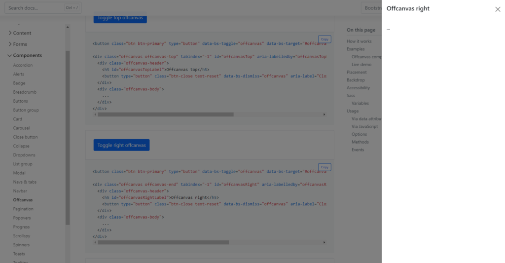
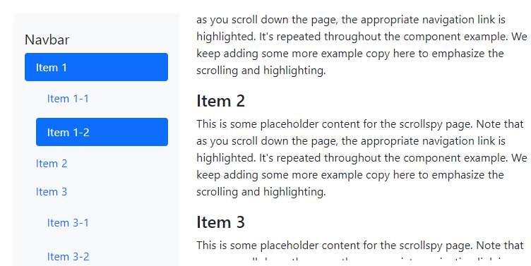
There are several other components which are nicely tackled by the bootstrap CSS Classes and JavaScript. Refer to the bootstrap documentation for details on those.










In case you want to learn more on Advanced CSS topics, click here.